
Exploring the Elegance of Script Fonts in Design
Learn how script fonts bring elegance to graphic design, explore popular script writing fonts, and understand script typography’s role in fashion and design culture.
Learn how script fonts bring elegance to graphic design, explore popular script writing fonts, and understand script typography’s role in fashion and design culture.

Discover mobile app design inspiration and explore free app design templates to create stunning applications. Enhance your design skills with creative ideas.
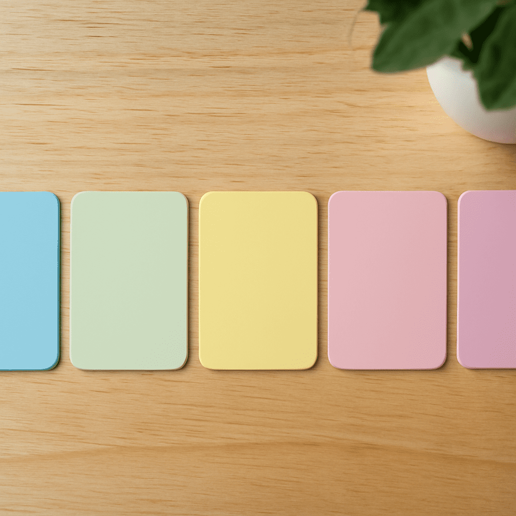
Pastel colors, with their soft and muted tones, have captured the hearts of designers worldwide. These colors are known for their soothing qualities and timeless appeal. Whether used in branding, fashion, or interior design, pastel colors offer a versatile palette that can transform any project. By understanding how to create and use a pastel color palette, designers can infuse their work with both elegance and charm.
Pastel colors are typically characterized by their low saturation and high value, giving them a washed-out or diluted appearance. This unique quality makes them ideal for creating calm and inviting visuals. Pastel shades such as soft pinks, gentle blues, and light greens are often associated with springtime, evoking feelings of renewal and tranquility. The allure of pastel colors lies in their ability to balance subtlety with vibrancy, making them a favorite choice for designers looking to create an understated yet impactful aesthetic.
Building a pastel color palette involves selecting colors that complement each other while maintaining the signature softness of pastel tones. Start by choosing a base color, such as a muted lavender or a pale turquoise. From there, add analogous colors—those next to each other on the color wheel—to create harmony. For example, pairing a soft peach with a warm lemon yellow can produce a cohesive and visually pleasing pastel palette. It’s important to ensure that each color retains its pastel quality by adjusting the saturation and lightness to prevent any one color from overpowering the others.
Pastel palettes are incredibly versatile and can be used across various design projects. In branding, pastel colors can convey a sense of approachability and serenity, often favored by brands in the wellness and lifestyle sectors. Websites utilizing pastel palettes benefit from a welcoming and user-friendly atmosphere, enhancing the overall user experience. In print design, pastels add a touch of elegance and sophistication, making them an excellent choice for wedding invitations, greeting cards, and other stationary products.
To use pastel colors effectively, consider the context and audience of your design. Pastels work well in designs aimed at a more relaxed and gentle aesthetic, but they may not be suitable for projects requiring bold and dynamic visuals. Contrast is key when working with pastels; pairing them with neutral colors like white or gray can help them stand out without losing their softness. Additionally, incorporating textures or patterns can add depth and interest to a pastel-based design. By strategically balancing pastel tones with complementary elements, designers can create stunning visuals that captivate and soothe the viewer.

Discover how green colors, shades, and tones influence graphic design. Learn to create striking visuals using diverse green palettes.
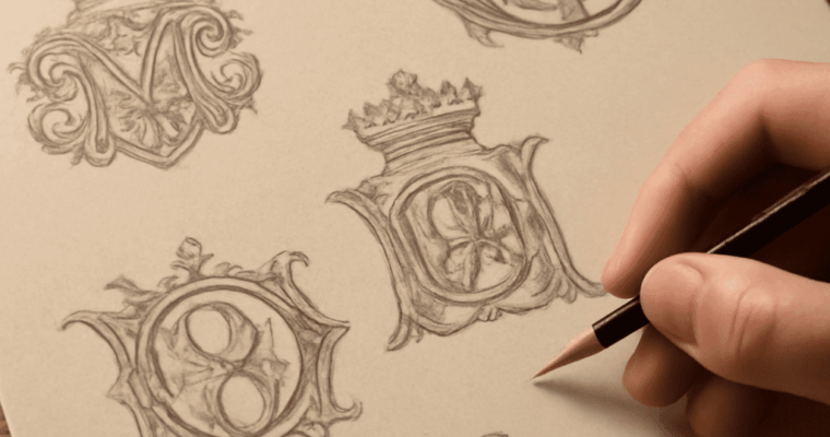
Explore how to use a monogram maker effectively, choose the right initials, and create stunning three-letter monograms in fashion and design culture.
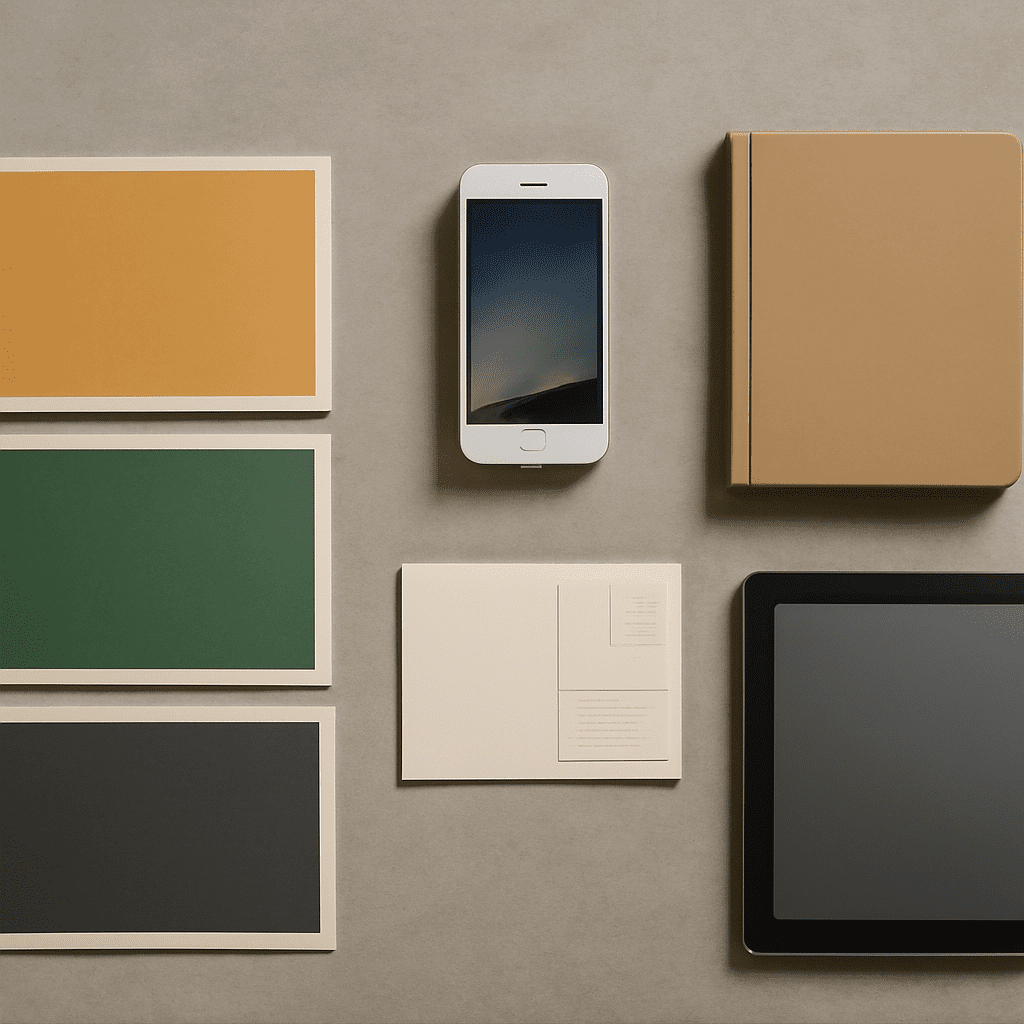
In graphic design, understanding the different poster sizes is essential for creating effective and visually appealing designs. Whether you’re designing for a movie release, an event, or a personal project, knowing the dimensions of standard poster sizes can significantly impact how your design is perceived. This article will explore the most common poster dimensions, their applications, how they fit on walls, and tips for choosing the right size for your design.
The most commonly used standard poster size is 24 x 36 inches (61 x 91 cm). This size is popular because it provides a good balance between visibility and detail, making it ideal for various advertising and promotional purposes. Another widely used size is the A1 poster, which measures 23.4 x 33.1 inches (59.4 x 84.1 cm). In the United States, posters often come in dimensions such as 11 x 17 inches (28 x 43 cm), 18 x 24 inches (46 x 61 cm), and 27 x 40 inches (69 x 102 cm), each serving different needs and spaces.
Different poster sizes are suitable for various applications based on the message and intended audience. Small posters, such as those measuring 11 x 17 inches, are often used for indoor events, announcements on bulletin boards, or as handouts. Medium-sized posters, like 18 x 24 inches, are frequently utilized for smaller promotional events, art prints, or educational purposes, providing more space for graphics and text.
Larger posters, such as the standard 24 x 36 inches, are favored for outdoor advertising, movie posters, and exhibitions, where visibility from a distance is crucial. The 27 x 40 inch size, also known as the “one-sheet” size in the film industry, is used in cinemas for movie promotions. A1 posters are popular in Europe for large-scale advertising and public information campaigns.
When considering poster sizes on walls, it’s important to assess the available space and the impact you want to achieve. For home decor, the 24 x 36 inch size fits well on most walls, offering a significant visual impact without overwhelming the space. Smaller sizes, like 11 x 17 inches, can be used in groups to create a gallery wall effect or as accents within larger arrangements.
In office settings or public spaces, larger posters such as 27 x 40 inches can be the focal point of a wall, drawing attention from across the room. For exhibitions or showrooms, using a combination of different poster sizes can create a dynamic and engaging display.
When deciding what size is a poster for your specific project, consider the purpose of the poster, the viewing distance, and the amount of information or imagery involved. For designs with detailed graphics or extensive text, larger sizes like 24 x 36 inches or A1 allow for greater readability and impact. If portability and distribution are priorities, smaller sizes such as 11 x 17 inches are more practical.
Additionally, think about the medium and location where the poster will be displayed. For outdoor posters that need to withstand weather conditions, durable materials in larger sizes are recommended. Conversely, indoor posters can prioritize design and aesthetics over material durability.
Ultimately, choosing the right poster size involves balancing practical considerations with creative goals. Understanding the standard poster sizes and their typical applications can help you make informed decisions that enhance the effectiveness of your design.

Discover the intricacies of Rococo art, its defining features, influences during the Rococo era, and its lasting impact on art history.

Uncover the history, architecture, and cultural significance of the Leaning Tower of Pisa, an iconic symbol of Italy’s rich heritage and a must-see landmark.
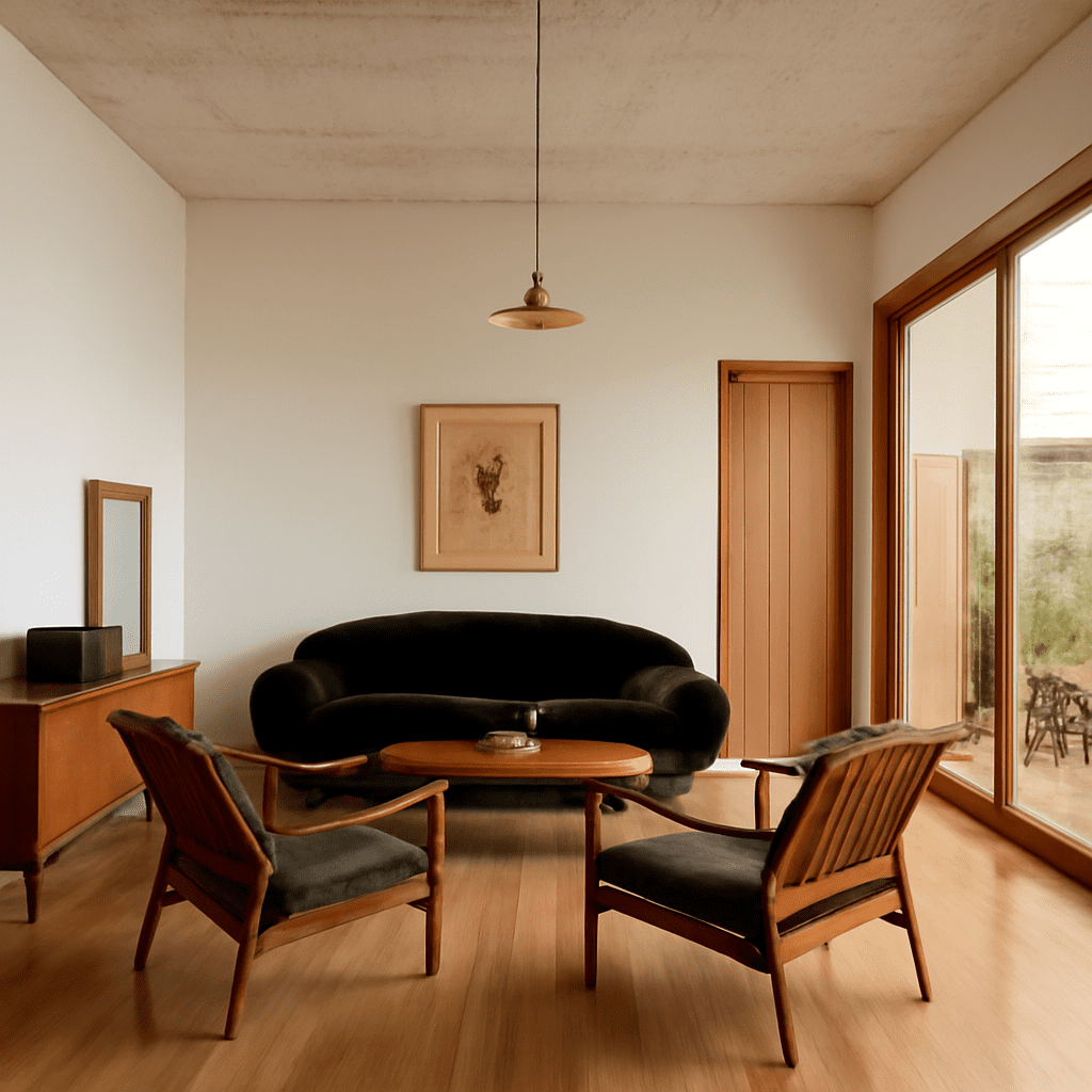
Mid century modern architecture, often simply referred to as “mid-century,” represents a significant design movement that emerged in the mid-20th century. Celebrated for its simplicity, integration with nature, and innovative use of traditional materials, mid century modern design continues to captivate architects and homeowners alike. This article delves into the origins, key features, and enduring influence of this iconic style, highlighting some of the most exemplary structures that epitomize mid-century modern design.
The roots of mid century modern architecture can be traced back to the aftermath of World War II, a period marked by rapid technological advancement and social change. With a newfound sense of optimism, architects sought to create spaces that reflected modern living. Influences from the Bauhaus movement, which emphasized functionality and simplicity, played a significant role in shaping this architectural trend. Architects like Ludwig Mies van der Rohe and Walter Gropius introduced concepts that favored open spaces, clean lines, and a harmonious relationship with the natural environment.
Mid century modern design is characterized by several distinct features that set it apart from other architectural styles. One of the most notable aspects is the emphasis on open floor plans, which promote fluidity between indoor and outdoor spaces. This is often achieved through large windows and sliding glass doors that allow for abundant natural light and unobstructed views of the surrounding landscape.
Another hallmark of mid century modern architecture is the use of traditional materials in innovative ways. Wood, metal, and glass are commonly employed to create structures that are both functional and aesthetically pleasing. The design also often incorporates flat planes and geometric forms, along with minimal ornamentation, to maintain a sleek and uncluttered appearance.
Mid century modern architecture has had a lasting impact on contemporary design, with many modern architects drawing inspiration from its principles. The style’s focus on simplicity, sustainability, and integration with nature resonates strongly with current architectural trends. Elements such as open floor plans and large glass facades are now commonplace in modern homes and commercial buildings, echoing the mid-century ethos of bringing the outside in.
Moreover, the resurgence of interest in mid-century furniture and decor has further solidified the style’s place in contemporary design. Iconic pieces from designers like Charles and Ray Eames continue to be sought after, blending seamlessly with modern interiors and highlighting the timeless appeal of mid-century aesthetics.
Several structures stand out as quintessential examples of mid century modern architecture. The Farnsworth House, designed by Ludwig Mies van der Rohe in 1951, is a prime example of the style’s emphasis on transparency and connection with nature. Its minimal steel and glass construction set within a natural setting exemplifies the seamless integration of the built environment with its surroundings.
Another iconic example is the Eames House (Case Study House No. 8), designed by Charles and Ray Eames in 1949. This residence showcases the use of prefabricated materials and innovative construction techniques to create a functional yet visually striking living space.
The Kaufmann House in Palm Springs, California, designed by Richard Neutra in 1946, is yet another masterpiece of mid-century modern design. Renowned for its horizontal lines, open spaces, and expansive glass walls, the Kaufmann House perfectly captures the essence of the style.
Through its distinctive features and enduring influence, mid century modern architecture remains a beloved and influential design movement that continues to shape the way we build and live today.

Discover the architectural brilliance of the Taj Mahal, explore its historical significance, and uncover fascinating facts about this iconic symbol of love.