
What Is a Baby Pack and Play? Uses, Benefits, and Tips
Discover what a baby pack and play is, how it works, its main uses, safety tips, and what to look for when buying one for your child. Learn about this versatile nursery essential.
Discover what a baby pack and play is, how it works, its main uses, safety tips, and what to look for when buying one for your child. Learn about this versatile nursery essential.
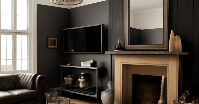
Discover creative wall paneling ideas and the best wall covering options for transforming your interiors. Explore materials, styles, and expert tips for every room.
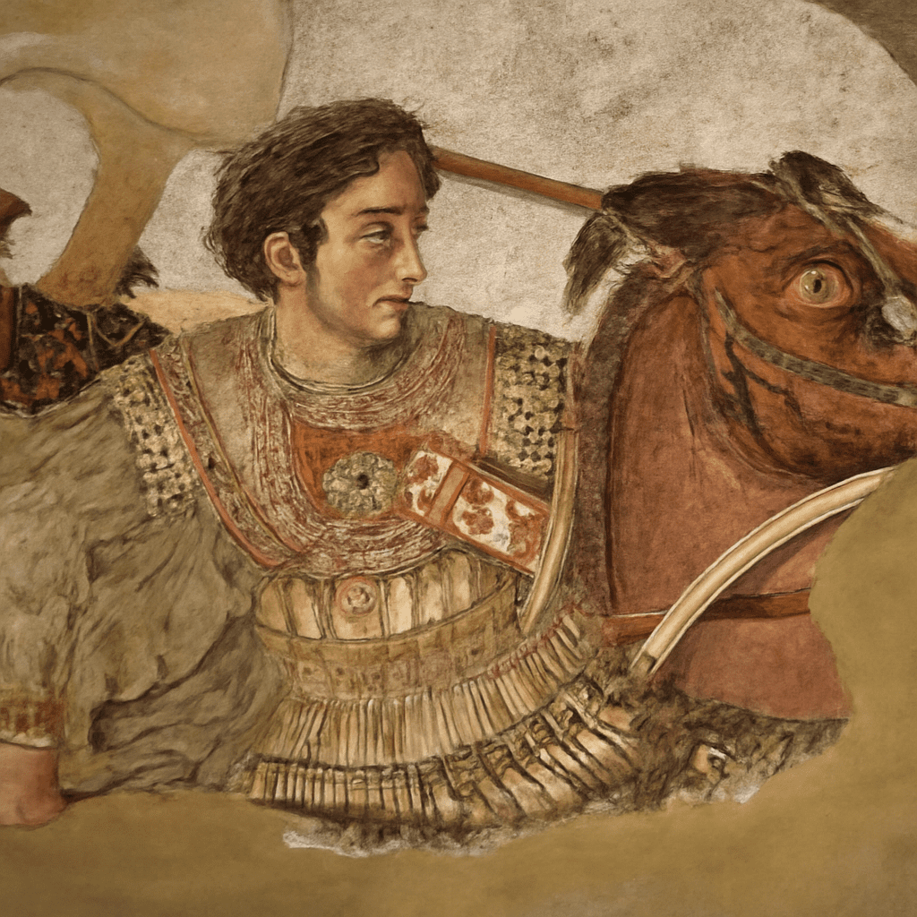
A wall in an ancient Roman house could seem to open onto a colonnade, hold a mythological scene or surround a gathering with vivid figures. The surviving wall paintings of Pompeii show how color and imagery helped shape an interior, even when the architecture itself remained solid and enclosed.
Many Pompeian frescoes survived because volcanic material buried the city after Mount Vesuvius erupted in 79 CE. The same eruption affected villas nearby. Some paintings remain in their original buildings; others were removed after excavation and are now displayed in museums, where their modern setting changes how they are encountered.
Pompeii frescoes were not usually isolated pictures hung on blank walls. Decorative bands, architectural forms and images could work together across an entire room. A visitor might move past a painted column and encounter a figure or a small landscape framed by ornament. What looks like a single panel today was often one element in a larger scheme.
Roman wall painting had several conventions, and scholars group many surviving examples into four broad styles. These categories help describe changing choices rather than rigidly separate every workshop or building. As the Metropolitan Museum of Art explains, painters could imitate colored stone, create elaborate architectural views or arrange small scenes on strongly colored fields.
Looking at Pompeii murals begins with the room’s edges. A painted base can appear to support imaginary columns; a horizontal band can organize figures into a continuous scene. These details matter because a visitor experienced the pictures while standing, sitting and moving within an actual space, not only while looking straight at one section.
A Pompeii fresco begins with a prepared wall and layers of plaster. In the fresco technique, pigment mixed with water is applied to fresh lime plaster; as the plaster sets, the pigment becomes bound into its surface. Painters could use preliminary marks to guide the design and work in manageable sections while the plaster was still suitable for painting.
Not every visible detail was necessarily applied while the plaster was wet. The Met’s account of Roman painting techniques notes that artists also added some colors on dry plaster, a method known as a secco. A close look at surviving frescoed walls in Pompeii therefore brings together craft, material and the passage of time, as well as the image itself.
The materials also affected appearance. Dark backgrounds, red fields and lighter architectural details could make small scenes or figures stand out sharply. The color seen today has passed through centuries of burial, excavation and conservation, so a modern viewer sees a surviving surface rather than an untouched new room.
The Villa of the Mysteries, just outside Pompeii’s ancient city walls, contains a striking room with figures set against a rich red ground. Women, mythological beings and other figures unfold across three walls, their gestures carrying the eye around the room. The archaeological park’s guide links the scene to Dionysus and dates the frieze to around 80–70 BCE.
The scene is often discussed in relation to ritual, although its full meaning remains debated. It is productive to begin with what can be seen: the figures are nearly life-size, and the red field unifies scenes that occupy different stretches of wall. Their scale gives the impression that the room is shared with an unfolding event, rather than decorated with a series of separate small pictures.
These Pompeii frescoes are particularly revealing as interior design. Fresco painting at Pompeii could make architecture and figures work together. The painted participants occupy the same enclosed space as the people who once used the room, while the bands above and below establish a visual structure. The image gains much of its force from wrapping around the architecture.
A second example comes from a villa at Boscoreale, north of Pompeii, rather than from a house inside the city. The Metropolitan Museum’s reconstructed bedroom, dated about 50–40 BCE, preserves wall paintings from the Villa of P. Fannius Synistor. Painted columns and parapets frame imagined courtyards, buildings and a garden; a fountain and fruit add smaller details to the expansive scene.
The effect is different from the figures at the Villa of the Mysteries. Here the wall seems to recede, offering views beyond the room through an architecture that exists only in paint. Columns establish a foreground, while the distant buildings and vegetation create layers for the eye to explore. This architectural illusion is associated with the Second Style of Roman wall painting.
The room now stands in a New York museum. Its painted walls came from the ancient villa, but the display is a reconstruction, not the original room still standing at Boscoreale. A Met publication notes that the mosaic floor and furnishings shown in its historical reconstruction came from other Roman villas. That distinction helps viewers appreciate both the original decoration and the later choices that make it legible.
Pompeii paintings reward attention at two scales. Pompeian wall frescoes gain meaning from their setting. From a distance, the major divisions determine whether a room feels enclosed by figures or opened by imaginary architecture. Up close, a painted shadow, border or small object explains how that larger effect was made. Comparing painted walls from Pompeii with the nearby Boscoreale room reveals not one formula, but a range of ways to turn plaster into an inhabited visual world.
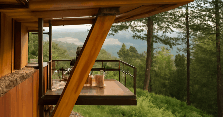
Explore the essentials of modern cabin architecture, discover inspiring cabin design features, and see examples of contemporary retreats that blend comfort with style.

Discover creative dining room table centerpieces and dining table decorations to elevate your space. Get inspired with stylish, practical, and seasonal ideas for every home.

A portfolio is a curated showcase of your best work, designed to highlight your skills, experience, and unique style. Whether you’re an artist, designer, photographer, or creative professional, a well-structured portfolio can open doors by communicating your value to potential clients, employers, or collaborators. If you’re searching for what does a portfolio look like, this guide will walk you through the standard structure, essential elements, and provide real online portfolio examples to inspire your own creation.
At its core, a portfolio presents your work in an organized, visually appealing format. Most portfolios—especially online—follow a clear pattern: a homepage or introduction, project galleries, detailed project pages, and a way for viewers to contact you. The goal is to make your best work easy to find and your process easy to understand.
Portfolios vary based on profession and medium. For example, a graphic design portfolio typically features digital images, mockups, and process shots, while a photographer’s portfolio may focus on high-quality photo galleries. Regardless of field, the best portfolios keep navigation simple and prioritize the viewer’s experience.
Modern online portfolios often take the form of personal websites, but they can also be hosted on platforms like Behance, Dribbble, or Adobe Portfolio. The visual layout usually incorporates a clean header or navigation menu, grid or carousel galleries for featured work, and consistent branding through colors, fonts, and imagery. A successful example portfolio will balance visual appeal with functionality, ensuring your work is the star.
For artists and studio practitioners, portfolios might also include statements about creative process, materials used, and the conceptual themes behind the work. The look and feel should reflect your personal or studio identity—minimalist, bold, playful, or experimental—while remaining professional and accessible.
Every standout portfolio, whether online or in print, shares certain core elements. These building blocks help you present your work clearly and persuasively:
Additional enhancements may include testimonials, press features, blog posts, or a list of exhibitions and clients. The overall layout should be mobile-friendly, fast-loading, and visually consistent. Remember, a strong portfolio is not just a collection—it’s a narrative that tells your story through your work.
When considering what does a portfolio look like for your specific field, analyze the expectations of your target audience. Creative employers may prefer a sleek, modern design, while academic or fine art audiences might expect formal project documentation and artist statements. Always curate with intention—quality over quantity.
Looking at real online portfolio examples is one of the best ways to spark ideas and identify best practices. Here are several notable portfolio sites, each with distinctive strengths:
Each example portfolio shares key features: clear navigation, strong visual hierarchy, and storytelling through project selection and presentation. They also highlight the creator’s unique perspective, whether through color palettes, motion, or the tone of written content.
For artists and studio practitioners, portfolios like those of Olafur Eliasson (olafureliasson.net) or Julie Mehretu (gladstonegallery.com/artist/julie-mehretu) are instructive. Eliasson’s site features project documentation, exhibition histories, and media mentions, providing a rich context for his installations. Mehretu’s gallery-hosted portfolio demonstrates how professional representation can shape online presence, combining high-resolution images with exhibition lists and critical essays.
As you review online portfolio examples, notice how each creator tailors their site’s look and structure to fit their field and audience. Consider how you might adapt these strategies to your own work, balancing inspiration with originality.
Building a portfolio that stands out requires intention and polish. Start by defining your audience—are you targeting potential employers, clients, galleries, or collaborators? This will inform both the content you include and the overall style.
Curate your best work, not just all your work. Aim for 8-12 strong pieces that showcase your range and depth, but don’t overwhelm viewers. For each project, document your process: show before-and-after shots, concept sketches, or progress images alongside the final result. This gives insight into your skills and problem-solving abilities.
Choose a platform that matches your technical comfort and visual goals. For many creatives, platforms like Squarespace, Wix, or WordPress offer customizable templates with drag-and-drop functionality, while dedicated portfolio sites like Behance, Adobe Portfolio, or Dribbble let you reach established creative communities. If you have web development skills, coding a custom portfolio provides the most flexibility.
Focus on usability and accessibility. Test your portfolio on different devices to ensure it looks good everywhere. Use clear fonts, sufficient contrast, and descriptive image alt text. Keep file sizes optimized for fast loading and make contact information easy to find. Update your portfolio regularly as your skills and projects evolve, and don’t be afraid to remove older work that no longer represents your best abilities.
Finally, inject your personality and story into your portfolio. Whether through your visual identity, written statements, or curatorial choices, your portfolio should help viewers get a sense of who you are as a creative professional. Use the online portfolio examples above as inspiration, but tailor the structure and elements to fit your own goals and studio practice.

Learn how to create a standout YouTube channel banner template tailored for fashion and design culture. Explore size tips, design elements, and free header resources.
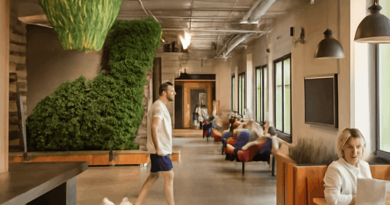
Discover practical interior office design tips and creative ideas for designing an office that enhances productivity, comfort, and team collaboration. Get inspired for your workspace.
A red bundle rests on a diner floor beside a boy on a stool. A state trooper sits close by, and a counterman leans toward them. In Norman Rockwell’s art, a carefully placed object can turn an ordinary encounter into a story that a viewer begins to complete.
The style of Norman Rockwell combines recognizable settings with expressive faces, measured poses, and details that direct attention. His illustrations can be funny or troubling, intimate or public, but they often ask the viewer to read the relationships between people.
Norman Rockwell, artist and prolific illustrator, was born in New York in 1894 and trained there as a young man. The Smithsonian American Art Museum credits him with more than 300 covers for The Saturday Evening Post, alongside work for books, calendars, posters, and advertisements. Magazine covers needed to catch a reader’s eye quickly, and his pictures often organize a scene around a readily grasped situation.
The Norman Rockwell art style is representational, with recognizable people and objects rendered through careful observation. Yet its effect depends on selection and arrangement. A glance, a prop, or the space between two figures can suggest what happened before the pictured instant and what might follow it. The composition makes the viewer an attentive witness.
The Runaway, an oil painting used for a 1958 Saturday Evening Post cover, places a small boy beside a much larger state trooper at a diner counter. Their positions put the pair in conversation, while the counterman’s attentive posture completes a compact triangle of figures. The empty space around them keeps the encounter clear.
The bright red bundle beneath the boy signals that he has left home. Its stick points toward the trooper, connecting the object to the person who may be helping him. In the Norman Rockwell style, a small detail can perform the work of a sentence: it identifies the boy’s situation without requiring a caption inside the image.
The museum’s audio tour records that Richard Clemens, a Massachusetts state trooper, posed for the picture and that Rockwell photographed the models in different positions. The illustrator Norman Rockwell constructed the arrangement through observation and selection. Bootlaces, a notebook, and reflections enrich the setting, but the boy, the officer, and the bundle remain the narrative anchors.
In Freedom from Want, published by the Post in 1943, a turkey arrives at a crowded table. Faces turn toward one another, and the white cloth creates a bright space around which the family gathers. The food is prominent, but the exchanges of expression make the meal feel like a shared event.
The Norman Rockwell Museum explains that the scene was assembled from individual sittings with models, including neighbors and family members. It was part of the Four Freedoms series created during World War II. The image translates an abstract ideal into a domestic setting, inviting readers to recognize the value through a particular gathering.
A notable feature of Rockwell’s artistic style is the way each person has a place in the group without becoming isolated from it. Heads and shoulders form a lively pattern around the table, while the large white expanse keeps the composition legible. The result is a carefully made image of abundance, not a record of a single photographed dinner.
Rockwell’s visual language also addressed public conflict. The Problem We All Live With, commissioned for a 1964 Look magazine spread, depicts a Black schoolgirl escorted by federal marshals during school desegregation. It draws on events in New Orleans. The girl’s white dress and schoolbooks stand out against a wall marked by racist graffiti and a splattered tomato.
The adults are cropped above their shoulders, leaving the child’s face and determined stride as the scene’s human focus. The wall supplies evidence of hostility without showing a crowd. As the museum’s curriculum explains, Rockwell moved the girl’s position during planning so that the magazine’s central fold would not interrupt her passage across the two-page image.
This picture shows another dimension of Norman Rockwell as an artist: the same attention to a readable gesture and a telling object could serve a serious subject. Its spare arrangement gives the child’s movement a clear direction while the marks on the wall establish what she faces.
The artist Norman Rockwell often used staged photographs as working material. Models could try different poses, and individual details could be combined or adjusted in drawings and paintings. The resulting picture might look like a captured moment, but its relationships were deliberately composed. Normon Rockwell used poses, expressions, and objects to give the viewer a route through the scene.
When looking at a Rockwell illustration, it helps to follow that route: find the main figure, notice where the other people look, and then search for an object that changes the story. His art style places a viewer close to familiar gestures while arranging them for maximum clarity.
Were these works only magazine illustrations? Many began as images for publication, but they were also original paintings or drawings. The printed page shaped their design, while the original surface reveals the artist’s handling and the choices behind the reproduced image.
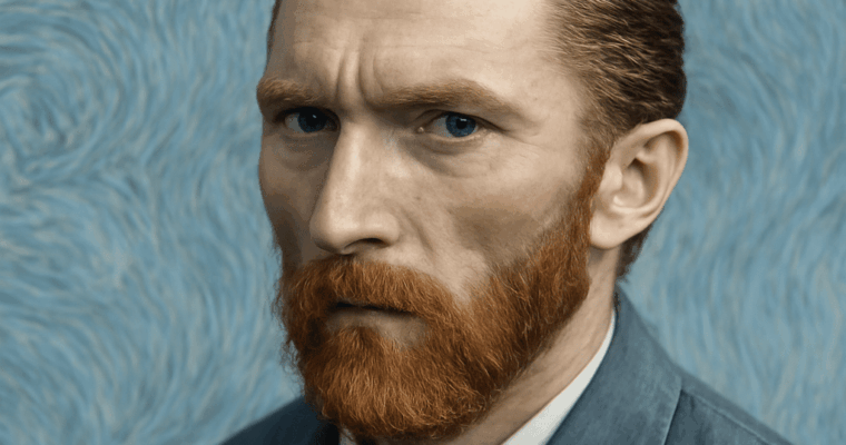
Discover why Vincent van Gogh cut off his ear, what led to this infamous event, and how it shaped his life and legacy. Explore the facts and theories behind Van Gogh’s ear incident.