Month: July 2026

Chinese Porcelain: Materials, Kilns, and Visual Traditions

Chinese Porcelain: Materials, Kilns, and Visual Traditions

Chinese porcelain is one part of a broader history. Learn how ceramics from China developed through earthenware, stoneware, celadons, white wares, kilns, vessel forms, glazes, and decoration.

Kinetic Sculpture: Art Designed to Move

Kinetic Sculpture: Art Designed to Move

Learn how kinetic sculpture uses wind, gravity, motors, magnets, water, and viewers to animate three-dimensional art—and how speed, sound, balance, and chance reshape what you see.

Famous Statues Across History: From Antiquity to Modern Art

Famous Statues Across History: From Antiquity to Modern Art

Famous statues across history include radically different objects: prehistoric limestone figures, royal monuments, bronze civic icons, and deliberately ordinary manufactured forms. This representative selection follows how artists and cultures used three-dimensional art to express belief, power, identity, and new ideas about form.

A famous sculpture is not important only because it is recognizable. Its material, setting, subject, and influence explain why it continues to shape the history of sculpture.

Famous Statues That Shaped Later Traditions: the Venus of Willendorf, Egypt’s Great Sphinx, Rome’s Augustus, and China’s Terracotta Army

Venus of Willendorf: Made by an unknown Gravettian artist in Central Europe, this small limestone figure dates to about 28,000–25,000 BCE. Found in present-day Austria, it emphasizes breasts, abdomen, and hips rather than facial detail. Its portable scale and simplified body make it an important early example of figurative carving, although its purpose cannot be proved as a fertility object.

Great Sphinx of Giza: Ancient Egyptian workers carved this monumental limestone figure around 2558–2532 BCE, probably during the reign of Khafre. Located beside the Giza pyramids, it combines a lion’s body with a king’s head. The union of animal strength and royal identity established a durable model for political and sacred monument-making.

Augustus of Prima Porta: This Roman marble statue, probably produced in the early first century CE after a bronze prototype, shows Emperor Augustus in military armor. Found near Rome and now associated with imperial portraiture, it uses the breastplate’s imagery to present Augustus as a victorious ruler and bringer of peace. Its idealized body helped define Roman state propaganda.

Terracotta Army: Craftspeople working for Qin Shi Huang created thousands of life-size terracotta soldiers around 210–209 BCE for the emperor’s mausoleum near Xi’an, China. Their varied faces, weapons, ranks, and horses suggest both individualized modeling and large-scale organization. The burial complex transformed sculpture into an image of an entire imperial system.

Michelangelo Statues: David, Pietà, and Moses as Individual Masterpieces

David: Michelangelo carved this monumental marble figure in Florence between 1501 and 1504. The biblical hero stands alert before his fight with Goliath, with a tense expression and controlled contrapposto. Its enlarged hands and head reinforce concentration, while its ideal anatomy made the statue a defining achievement of Renaissance humanism and a civic symbol of Florentine independence.

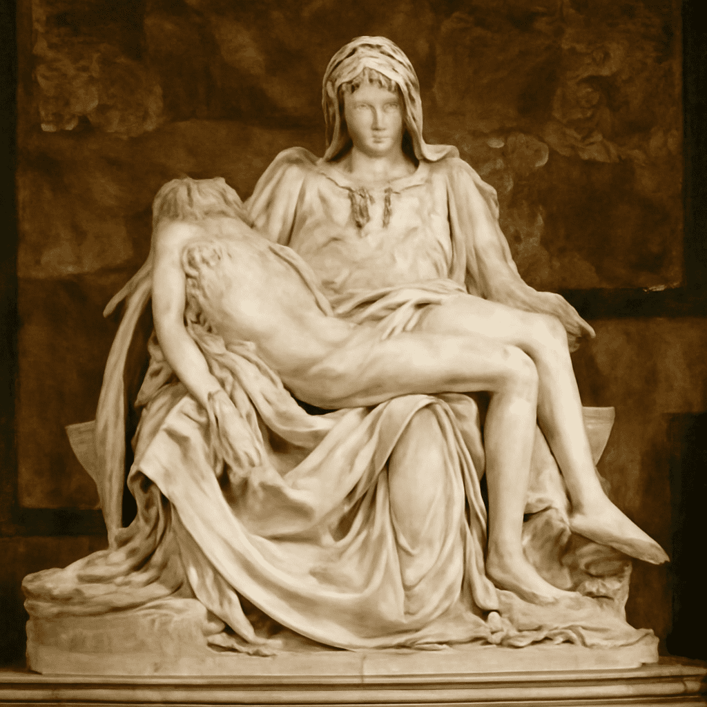
Pietà: Created in Rome around 1498–1500, this polished marble group shows the Virgin Mary holding the dead Christ in St. Peter’s Basilica. Michelangelo fits the figures into a stable pyramid while contrasting Mary’s youthful serenity with Christ’s limp body. The work’s refined surface, emotional restraint, and unified composition became a central model for later religious sculpture.

Moses: Michelangelo carved this marble figure in the early sixteenth century for the unfinished tomb of Pope Julius II; it now stands in San Pietro in Vincoli, Rome. The seated biblical lawgiver grips his beard and turns with contained energy. Horns derived from a Latin biblical translation and the statue’s powerful tension show how Michelangelo made a single figure carry theological and monumental force.

Monuments and Sculpture in Public Space: Bartholdi’s Statue of Liberty and Rodin’s The Burghers of Calais

Statue of Liberty: Frédéric Auguste Bartholdi designed this copper repoussé figure, assembled over an iron framework engineered by Gustave Eiffel, between 1875 and 1886. Standing in New York Harbor, the personification of Liberty Enlightening the World holds a tablet and torch. Its scale, industrial construction, and public setting connected sculpture with engineering, immigration, and modern national identity.

The Burghers of Calais: Auguste Rodin modeled this bronze monument between 1884 and 1895 for a public site in Calais, France. It depicts six citizens walking to surrender themselves during the Hundred Years’ War. Instead of presenting one triumphant hero on a pedestal, Rodin gives each figure a distinct psychological response, changing the emotional language of civic monuments.

Famous Sculpture Beyond the Carved Figure: Brâncuși’s Bird in Space, Picasso’s Guitar, and Duchamp’s Fountain

Bird in Space: Constantin Brâncuși developed this series in Paris from 1923, including highly polished bronze versions. The narrow, rising form reduces a bird to an impression of flight rather than a literal body. Its abstract simplicity helped establish that sculpture could convey movement and essence through reflective surface and vertical rhythm.

Guitar: Pablo Picasso’s 1912 construction in Paris used cardboard, paper, string, and wire rather than carved stone or cast metal. By assembling and cutting materials, Picasso turned a familiar instrument into a Cubist structure of planes and openings. The work helped introduce construction, collage, and mixed media as fundamental modern sculptural methods.

Fountain: Marcel Duchamp presented this manufactured porcelain urinal in New York in 1917 under the name “R. Mutt.” Though the original is lost, authorized replicas preserve its role as a readymade. By selecting and repositioning an ordinary object, Duchamp challenged the assumption that artistic skill, handcraft, and beauty were required for sculpture.

How to Look Beyond Fame: Material, Scale, Context, and Influence

Compare these works through four practical questions:

  • Material: Does limestone, marble, bronze, terracotta, copper, or a found object determine the work’s texture and durability?
  • Scale: Was it designed for the hand, a tomb, a temple complex, a museum, or a city harbor?
  • Context: Does the subject serve ritual, burial, political authority, civic memory, religious devotion, or artistic provocation?
  • Influence: Did the work establish a new body type, monument format, construction method, or definition of what sculpture could be?
Bead Loom Designs: How to Design and Read a Chart

Bead Loom Designs: How to Design and Read a Chart

Bead loom designs become easier to read when warp count, bead columns, rows, repeats, and centerlines map clearly. Learn to chart three motifs, keep edges clean, and resize or recolor them.

Types of Quilt Patterns: From Traditional Blocks to Modern Designs

Types of Quilt Patterns: From Traditional Blocks to Modern Designs

Learn the main types of quilt patterns, from repeated pieced blocks and appliqué to medallions, rows, whole-cloth work, and improvisation—and see how scale, color, and negative space shape each design.

Blue Color Combinations That Stay Balanced

Blue Color Combinations That Stay Balanced

The most reliable blue color combinations start with choosing the blue itself, not its partner. Pale cyan, dusty blue, vivid cobalt, and deep navy create different visual conditions before proportion or contrast is considered. Use the same process for rooms, branding, clothing, graphics, and product styling: identify the blue’s value, saturation, and undertone, then assign supporting, accent, and neutral roles.

These blue palettes show how related hues can remain balanced without making every scheme feel cold, flat, or overly bright.

Start with Blue Color Combinations by Choosing Value, Saturation, and Undertone

Value describes how light or dark a blue appears. Light blue, such as airy cyan or powder blue, has a high value and often needs a darker anchor. Dark navy has a low value and usually benefits from lighter surroundings. Mid-value blue, including denim or classic cobalt, is more flexible but can become heavy when used across too much of a composition.

Saturation describes intensity. A saturated cobalt attracts attention and works best with restrained partners. A muted blue containing grey is quieter and can support stronger earthy or warm accents. Combining several highly saturated colors often creates visual competition, while combining only pale colors can remove useful definition.

Do not treat every blue as cool. A blue with a green or cyan undertone generally feels fresher and cooler; a blue with a violet, red, or slightly purple undertone can feel warmer and richer. The surrounding colors also change its apparent temperature. Test a blue beside its intended partner rather than judging a swatch in isolation.

Build blue palettes with Monochromatic and Analogous Relationships

Monochromatic schemes use one blue family across several values and saturations. They are usually the easiest way to create unity. For example:

  • Airy monochromatic: dominant sky blue, supporting powder blue, accent ink navy, and warm white as the neutral.
  • Grounded monochromatic: dominant denim blue, supporting muted slate, accent deep navy, and pale grey as the neutral.

The light shades keep the first palette open, while navy supplies definition. In the second, the neutral and value changes prevent several dark blues from becoming indistinct. A small amount of a darker accent can do more work than a large block of it.

Analogous schemes add neighbors on the color wheel. Blue-green creates a fresh, natural effect; blue-violet feels more atmospheric or decorative. Keep one hue dominant and let the neighboring hues support it:

  • Fresh analogous: dominant clear blue, supporting seafoam blue-green, accent deep teal, and soft white as the neutral.
  • Muted analogous: dominant dusty blue, supporting sage, accent softened violet, and taupe as the neutral.

Analogous colors are related, but they still need value separation. If all three are mid-value and similarly muted, the result may look muddy rather than harmonious.

Balance Blue Color Schemes with Orange, Warm Earth, Green, Violet, and Split Complements

Orange sits opposite blue, so even a small orange accent can create clear energy. Saturated blue with saturated orange is dramatic; muted blue with terracotta or ochre is easier to live with. Give the complement less area than the dominant blue unless a deliberately high-impact result is intended.

  • Balanced complementary: dominant medium blue, supporting blue-grey, accent burnt orange, and creamy white as the neutral.
  • Soft complementary: dominant dusty blue, supporting pale blue-grey, accent terracotta, and sand as the neutral.

Warm earth colors such as rust, clay, camel, ochre, and walnut make blue feel less clinical. They are especially effective with dark or muted blues because their lower saturation keeps the contrast controlled. A bright orange accent needs more surrounding space or a quieter blue to avoid visual fatigue.

Green and violet offer neighboring or split-complementary options. Green-blue combinations feel botanical when paired with olive, moss, or leafy green. Violet can add depth to a blue scheme, particularly when the blue already has a purple undertone. For a split complement, use the hues on either side of orange, such as coral and ochre, rather than orange alone:

  • Earthy split complement: dominant muted teal-blue, supporting olive green, accents terracotta and ochre, and natural linen as the neutral.
  • Deep jewel scheme: dominant cobalt, supporting blue-violet, accent plum, and charcoal as the neutral.

These combinations work because the accent colors are controlled by area, saturation, or both. A small vivid accent can balance a large muted field more effectively than several equally strong colors.

Ground Blue with White, Grey, Black, and Natural Neutrals

Neutrals determine how blue is perceived. Bright white makes a blue look cleaner and more energetic, while warm white softens cyan and prevents navy from feeling severe. Pale grey supports blue without introducing another strong hue, but a blue-grey next to a muted blue may lack enough contrast.

  • Clean contrast: dominant navy, supporting medium blue, accent bright white, and a small amount of coral.
  • Quiet natural: dominant softened blue, supporting warm grey, accent camel, and linen or light wood as the neutral.

Black gives saturated blue a graphic, modern edge, but large areas of both can feel dense. Use black for outlines, hardware, typography, or small grounding details. Natural neutrals such as beige, tan, cork, wood, stone, and rattan add texture as well as warmth, making them useful when a flat grey would feel too formal.

Set Palette Proportions and Test Value Contrast Across Paint, Fabric, and Objects

Begin with a flexible 60-30-10 structure: roughly 60% dominant color, 30% supporting color or neutral, and 10% accent. It is a starting point rather than a rule. A dark navy may need more light neutral space, while a pale blue may need a larger supporting dark to remain legible.

  1. Check value first. Convert a digital mock-up or photograph to greyscale. If the dominant and supporting colors merge, change their lightness before changing their hue.
  2. Limit saturation. Let one color lead in intensity. Pair vivid cobalt with softened neutrals, or reserve bright orange for a few intentional details.
  3. Test the actual medium. Paint can dry darker or duller than a screen preview; fabric changes with weave and lighting; glossy objects reflect nearby colors. View samples in daylight and the lighting where they will be used.
  4. Check scale and repetition. A color that works on a small cushion, button, or icon may overwhelm a wall, garment, or full-screen background. Repeat the accent in two or three small locations to create cohesion.

For text and interface work, use a clearly lighter or darker background rather than relying on hue contrast alone. For interiors and physical objects, step back from the samples: a balanced scheme should still show a clear focal blue, supporting hierarchy, and readable edges at a distance.

Christmas Color Palettes Beyond Red and Green

Christmas Color Palettes Beyond Red and Green

Build Christmas color palettes with hue relationships, value contrast, neutrals, saturation, and one controlled accent. Explore five adaptable schemes for print, interiors, tables, and crafts.