Exploring the Green Colors in Graphic Design
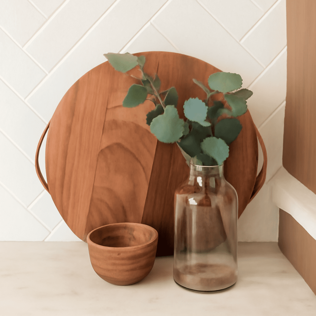
In the realm of graphic design, green colors play a pivotal role in creating vibrant and meaningful visuals. From evoking tranquility to symbolizing growth and renewal, the diverse spectrum of green offers designers endless possibilities. Understanding the nuances of the green color palette is essential for crafting striking designs that effectively convey desired messages. This article delves into the various shades and tones of green, exploring their impact on visual composition and how to create harmonious designs using these color shades.
Understanding Green Colors in Design
Green is a versatile color, often associated with nature, health, and tranquility. It occupies a unique space in the color wheel, blending the calming properties of blue with the vibrant energy of yellow. This duality makes green colors a popular choice in design, allowing for a range of emotional expressions and symbolism. In graphic design, green can be used to create balance, foster a sense of calm, or energize a composition. Its versatility is further enhanced by the vast array of green tones available, each bringing its own distinct character to the table.
Popular Shades of Green Color Palette
While the term “green” may conjure a single hue, the shades of green color palette are incredibly diverse. Popular shades include:
- Emerald: A rich, vibrant green that exudes luxury and sophistication. Often used in high-end branding, emerald green can create a sense of opulence and elegance.
- Olive: With its muted, earthy tones, olive green is associated with peace and tranquility. It’s a popular choice in designs aiming for a natural or organic feel.
- Lime: A zesty, fresh shade that brings energy and playfulness to designs. Lime green is ideal for youthful and dynamic compositions.
- Mint: Soft and subtle, mint green offers a sense of calm and refreshment. It’s commonly used in spaces that aim to promote relaxation and clarity.
Each green shade has unique properties that can be harnessed to evoke specific emotions and associations, making them invaluable tools in the designer’s palette.
How Green Tones Affect Visual Composition
Choosing the right green tones can significantly impact the overall visual composition of a design. The inherent properties of green tones can influence a viewer’s perception and emotional response. For instance, deeper tones like forest green can create a sense of stability and reliability, while brighter tones like chartreuse can evoke feelings of excitement and innovation.
Designers often use green to balance other colors within a palette. Due to its natural association with growth and harmony, green can act as a stabilizing element, providing cohesion and unity in multicolored designs. Additionally, green tones work well with a variety of other colors, from complementary reds and oranges to analogous blues and yellows, offering endless creative possibilities.
Creating Harmonious Color Shades of Green
Crafting a harmonious design with color shades of green involves thoughtful consideration of the color relationships within the palette. Start by selecting a dominant green shade that aligns with the intended mood of the project. From there, incorporate complementary or analogous colors to create balance and visual interest.
For example, pairing a deep emerald with subtle gold can produce an elegant and luxurious feel, while combining lime green with vibrant pink creates a lively and energetic design. When working with multiple shades of green, consider varying the saturation and brightness to add depth and dimension. This approach not only enhances the aesthetic appeal but also guides the viewer’s attention where it is most needed.
Ultimately, the key to using green colors effectively in design lies in understanding the psychology of color and how it influences human perception. By mastering the shades and tones of green, designers can create visually compelling compositions that resonate with their intended audience, ensuring that their message is communicated clearly and effectively.