Exploring the Beauty of Pastel Colors in Design
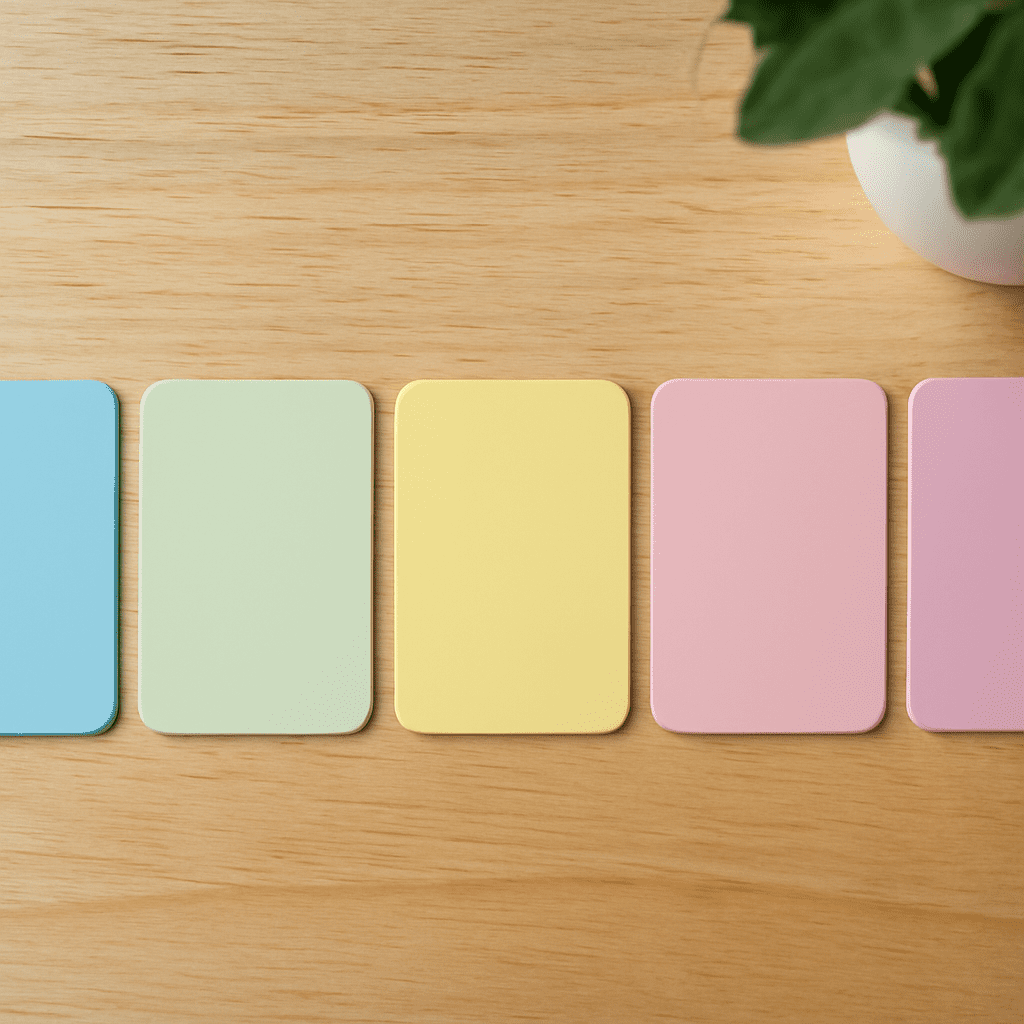
Pastel colors, with their soft and muted tones, have captured the hearts of designers worldwide. These colors are known for their soothing qualities and timeless appeal. Whether used in branding, fashion, or interior design, pastel colors offer a versatile palette that can transform any project. By understanding how to create and use a pastel color palette, designers can infuse their work with both elegance and charm.
The Allure of Pastel Colors
Pastel colors are typically characterized by their low saturation and high value, giving them a washed-out or diluted appearance. This unique quality makes them ideal for creating calm and inviting visuals. Pastel shades such as soft pinks, gentle blues, and light greens are often associated with springtime, evoking feelings of renewal and tranquility. The allure of pastel colors lies in their ability to balance subtlety with vibrancy, making them a favorite choice for designers looking to create an understated yet impactful aesthetic.
Creating a Pastel Color Palette
Building a pastel color palette involves selecting colors that complement each other while maintaining the signature softness of pastel tones. Start by choosing a base color, such as a muted lavender or a pale turquoise. From there, add analogous colors—those next to each other on the color wheel—to create harmony. For example, pairing a soft peach with a warm lemon yellow can produce a cohesive and visually pleasing pastel palette. It’s important to ensure that each color retains its pastel quality by adjusting the saturation and lightness to prevent any one color from overpowering the others.
Applications of Pastel Palettes in Graphic Design
Pastel palettes are incredibly versatile and can be used across various design projects. In branding, pastel colors can convey a sense of approachability and serenity, often favored by brands in the wellness and lifestyle sectors. Websites utilizing pastel palettes benefit from a welcoming and user-friendly atmosphere, enhancing the overall user experience. In print design, pastels add a touch of elegance and sophistication, making them an excellent choice for wedding invitations, greeting cards, and other stationary products.
Tips for Using Pastel Colors Effectively
To use pastel colors effectively, consider the context and audience of your design. Pastels work well in designs aimed at a more relaxed and gentle aesthetic, but they may not be suitable for projects requiring bold and dynamic visuals. Contrast is key when working with pastels; pairing them with neutral colors like white or gray can help them stand out without losing their softness. Additionally, incorporating textures or patterns can add depth and interest to a pastel-based design. By strategically balancing pastel tones with complementary elements, designers can create stunning visuals that captivate and soothe the viewer.