
Kerning vs Tracking: The Difference and When to Use Each
Kerning vs tracking explained with clear letter-pair and text-run examples. Learn when to adjust tracking, when to kern, and how font, case, size, and output affect spacing.
Kerning vs tracking explained with clear letter-pair and text-run examples. Learn when to adjust tracking, when to kern, and how font, case, size, and output affect spacing.
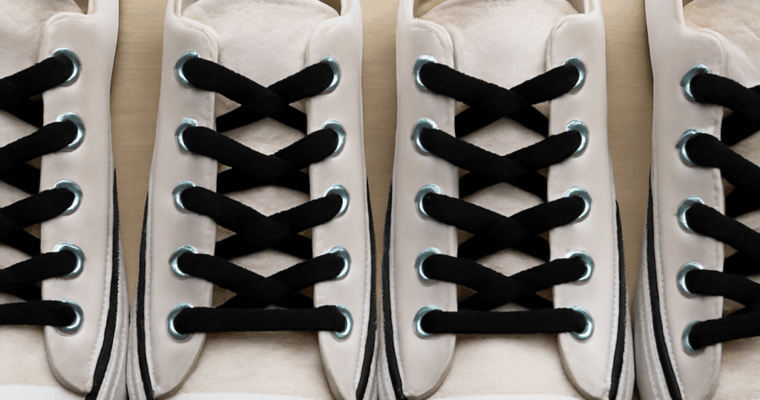
Learn shoe lace designs with paths for straight-bar, ladder, lattice, and star-like patterns. Compare shoelace designs by fit, tension, length, and tying speed. Pick cool lace designs for shoes.
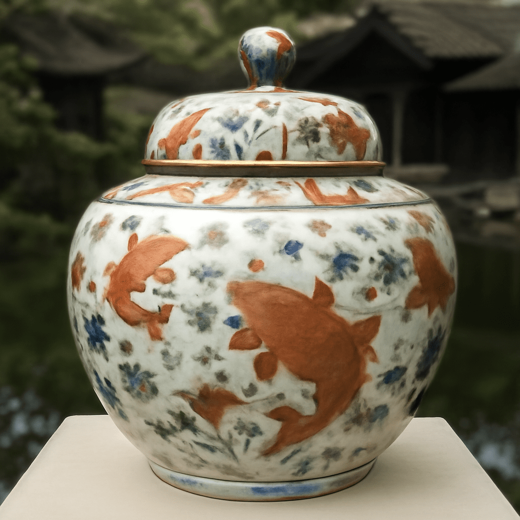
Chinese porcelain is one part of a much larger history of Chinese ceramics. The wider category includes clay objects hardened by heat, from porous cooking pots to dense vessels with glassy surfaces. Porcelain is a particular type of ceramic body, not a synonym for every fine, white, or decorated object made in China.
The most useful way to follow this history is to connect material to process: clay body, glaze, firing atmosphere, kiln region, vessel form, and decoration. Those factors explain why a celadon bowl, a Cizhou jar, and a blue-and-white dish belong to related but different traditions.
These terms overlap in ordinary speech, but they describe different scopes. Ceramic is the broad material category; pottery often means a ceramic vessel, especially one made from clay, although usage varies. In everyday trade language, china ceramics may mean tableware, but it does not specify composition or date.
Earthenware is generally fired at lower temperatures, often below about 1,100°C. Its body remains relatively porous unless covered by glaze, and it may be red, buff, gray, or pale. Stoneware is fired hotter, commonly around 1,100–1,300°C, producing a denser, more vitrified body that can be heavily glazed or left bare.
Porcelain is usually made from a refined, kaolin-rich body with feldspathic material and fired hot enough to become highly vitrified. Thin sections may transmit light, and the body is often white or near-white, but translucency and color vary. These are technical distinctions, not a ladder of quality: an earthenware figure, a stoneware storage jar, and a porcelain cup were made for different purposes and can each be technically accomplished.
Early Chinese potters made hand-built and wheel-thrown earthenware vessels for cooking, storage, serving, and ritual use. Neolithic painted wares, such as Yangshao vessels, use mineral pigments and geometric or animal designs, while Longshan black pottery demonstrates control of thin walls and a polished surface. Form and surface treatment already carried social and practical meaning.
During the Han period, potters developed more durable high-fired stonewares alongside brightly colored, lower-fired lead-glazed wares, expanding the range of colors and vessel types. Northern and southern kiln centers responded to local clays, fuels, and markets. Yue kilns in Zhejiang became associated with olive and blue-green celadons; later, northern Cizhou kilns used slip painting and bold brushwork on stoneware.
The Song period shows why Chinese ceramics cannot be reduced to one imperial style. Longquan produced influential celadons; Yaozhou favored carved decoration under green glaze; Ding became known for fine white wares; Jun wares used thick, opalescent blue and purple glazes; and Ru wares are noted for subtle blue-green surfaces. These kiln traditions overlapped in time and influence rather than forming a simple sequence.
Celadon names a glaze family rather than a single clay body. Iron in the glaze, combined with firing atmosphere, thickness, and cooling, can produce colors from gray-green to jade-like blue-green. Carving, incising, molded relief, and controlled pooling at the foot or rim gave celadon vessels visual depth. Longquan chargers, bowls, and large storage forms show how a restrained surface can depend on precise firing.
White wares likewise cover several bodies and methods. Ding potters used pale, iron-bearing glaze and fine forms such as bowls and dishes, often with incised or molded ornament. Dehua in Fujian later became known for smooth white porcelain figures and vessels, sometimes called blanc de Chine. White does not automatically mean porcelain, and a white glaze can conceal a darker body.
Jingdezhen emerged as a leading center for high-fired porcelain production, especially from the Song and Yuan periods onward. Cobalt was painted beneath a transparent glaze to create blue-and-white decoration, with scrolling plants, dragons, landscapes, and panels adapted to bowls, dishes, jars, bottles, and ewers. Ming production refined these effects for domestic and overseas markets; Qing workshops added overglaze enamels, famille rose palettes, and complex shaped forms. Export demand encouraged new designs, but did not erase regional Chinese traditions.
A careful reading starts with the exposed clay body, usually at the foot or an unglazed break. Its color, density, inclusions, and degree of vitrification can help separate an earthenware, stoneware, or porcelain body, while glaze pooling, bubbles, crazing, and firing marks provide additional process clues. These observations are strongest when considered together, not treated as isolated tests.
Next compare form and decoration with known kiln habits. A vessel’s proportions, wall thickness, foot shape, joining method, and molded or painted motifs may indicate intended use and workshop practice. Yet forms and patterns were repeatedly copied, revived, exported, and reinterpreted. A familiar dragon, lotus scroll, or blue-and-white layout can therefore belong to more than one period.
Marks and condition add context rather than certainty. An impressed, incised, or painted mark may identify an owner, workshop, reign, or later homage, and marks were sometimes copied. Wear, staining, glaze flaws, restoration, and fresh-looking surfaces can record use or later intervention, but none proves a date alone. Visual style is a starting point for comparing body, glaze, firing, kiln region, form, and decoration; attribution requires that whole group of evidence rather than appearance alone.

Learn how kinetic sculpture uses wind, gravity, motors, magnets, water, and viewers to animate three-dimensional art—and how speed, sound, balance, and chance reshape what you see.
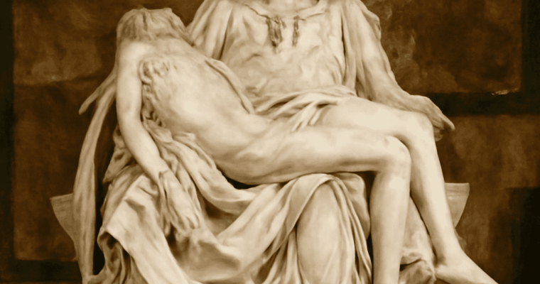
Famous statues across history, from the Venus of Willendorf and Augustus of Prima Porta to Michelangelo’s David, Pietà, and Moses. See how material, form, and public meaning changed sculpture.
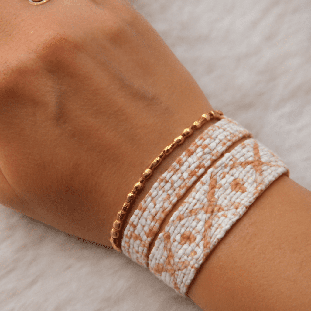
Bead loom designs become easier to plan when you treat the chart as a grid of individual beads. Decide the bead-column width first, then map each row, repeat, centerline, and color symbol before threading the loom.
The basic rule is simple: a flat loom band with N bead columns needs N + 1 warp threads. Rows run across the band, while warp threads run lengthwise. The starter charts below use original geometric motifs that you can follow directly or adapt.
Begin with the finished width you need. A 9-column bracelet, for example, requires 10 warp threads. The number of rows controls the motif’s height, not its wearable width. For a repeating band, choose a repeat unit that fits the available columns without leaving an awkward partial motif.
Sketch the outline in pencil before assigning colors. For a bracelet, test the repeat across at least two units. This reveals whether a diamond joins another diamond cleanly or whether a zigzag suddenly steps out of alignment.
In bead loom patterns, each chart cell represents one bead. A vertical stack of cells represents a bead column; a horizontal line of cells represents one beaded row or weft pass. Warp threads form the spaces between adjacent bead columns, so the outermost columns sit between the first and second warp threads and between the last two threads.
For example, a chart measuring 7 columns by 5 rows uses 8 warp threads and five rows of beads. The chart’s top and bottom edges show the band’s lengthwise row sequence, while its left and right edges show how a repeated unit will meet itself.
Use short symbols instead of coloring every square while drafting. A key such as A = blue, B = cream, and C = charcoal lets you count quickly and makes resizing less confusing. Keep the chart’s orientation visible: “top to bottom, left to right” is enough for a small pattern.
For a centered motif with an odd number of columns, draw the centerline through the middle column. Design one side, then mirror it across that line. With an even number of columns, place the centerline between the two middle columns and mirror each half across the gap.
Clean edges depend on what happens at the repeat boundary. A background color at both outer columns gives separate motifs breathing room. A pattern intended to flow continuously should have matching edge symbols: the final columns of one repeat must create the same transition as the first columns of the next.
Limit the palette to colors with clear contrast. Before weaving, inspect every row for accidental single-cell breaks, asymmetrical steps, or a center color that shifts from one row to the next.
In each chart, hyphens separate columns. Read rows from top to bottom and each row from left to right. Copy the stated repeat unit horizontally unless you are adding a deliberate border.
Diamond: 9 columns × 7 rows. Key: A = cobalt, B = ivory. Repeat unit: the complete 9 × 7 chart. Reading direction: left to right, top to bottom.
Rows: B-B-B-B-A-B-B-B-B
B-B-B-A-A-A-B-B-B
B-B-A-A-A-A-A-B-B
B-A-A-A-A-A-A-A-B
B-B-A-A-A-A-A-B-B
B-B-B-A-A-A-B-B-B
B-B-B-B-A-B-B-B-B
Zigzag: 8 columns × 4 rows. Key: A = teal, B = coral. Repeat unit: the first 4 columns, repeated twice across the chart. Reading direction: left to right, top to bottom.
Rows: A-A-B-B-A-A-B-B
A-B-B-A-A-B-B-A
B-B-A-A-B-B-A-A
B-A-A-B-B-A-A-B
Stepped triangle: 11 columns × 7 rows. Key: A = forest green, B = sand. Repeat unit: the complete 11 × 7 chart. Reading direction: left to right, top to bottom.
Rows: B-B-B-B-B-A-B-B-B-B-B
B-B-B-B-A-A-A-B-B-B-B
B-B-B-A-A-A-A-A-B-B-B
B-B-A-A-A-A-A-A-A-B-B
B-A-A-A-A-A-A-A-A-A-B
B-B-A-A-A-A-A-A-A-B-B
B-B-B-A-A-A-A-A-B-B-B
Resize by adding complete repeat units, not by stretching individual cells. The 4-column zigzag can make a 20-column band with five repeats. If you need 22 columns, add one background column to each edge rather than inserting two columns into the middle of the repeat.
Preserve symmetry by adding paired columns on opposite sides of an odd-width motif. If the original centerline is between two columns, keep it between two columns after resizing. Never add a single column to only one side unless an intentionally off-center design is wanted.
To recolor, replace every instance of one symbol consistently. For example, change every A in the diamond to red while keeping B as ivory. Do not recolor only one side of a mirrored motif. Finally, weave a short test strip containing two full repeats. A correct sample has a centered motif, matching joins, consistent edge behavior, and the intended number of bead columns.
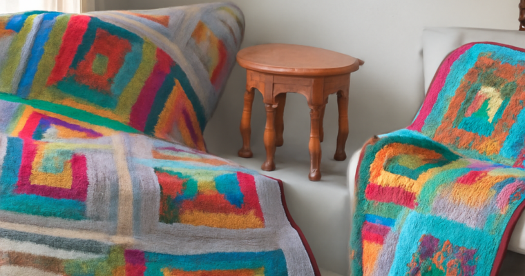
Learn the main types of quilt patterns, from repeated pieced blocks and appliqué to medallions, rows, whole-cloth work, and improvisation—and see how scale, color, and negative space shape each design.

Learn how to use blue color combinations with light, muted, saturated, and dark blues. Pair them with neutrals, complements, and warm accents. Balance undertone, value, saturation, and proportion.
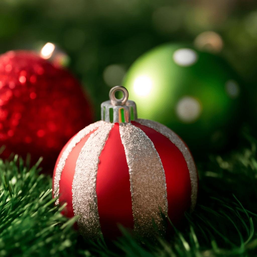
A successful Christmas color palette depends less on using familiar festive shades than on controlling their relationships. Red and green can feel traditional, while navy, clay, blush, or charcoal can feel equally seasonal when hue, value, saturation, and proportion work together.
Use one dominant color, one supporting color, a generous neutral, and one restrained accent. This structure keeps Christmas colours coherent across a screen, printed piece, room, table setting, or handmade object.
Build a palette by assigning each color a clear job:
A useful starting proportion is 50 percent dominant color, 30 percent supporting color, 15 percent neutral, and 5 percent accent. Adjust those figures when the medium demands it, but keep the accent controlled. Metallic-like gold, silver, or copper usually works best as a small highlight rather than a fourth dominant hue.
Red and green work because they provide immediate hue contrast: their complementary relationship makes both colors appear more vivid. They also combine a dark, cool-to-neutral green with a naturally attention-grabbing warm red, creating useful value and temperature contrast.
The pairing is reinforced by seasonal natural forms. Evergreen foliage supplies persistent green, while berries, fruit, and winter decorations provide red. Over time, these associations were repeated in decorative traditions and popular imagery, making the combination instantly recognizable. It is not the only Christmas color palette, but it is a strong base that can be softened with cream, darkened with burgundy, or refreshed with a restrained metallic accent.
These five Christmas color palettes use different hue relationships and levels of contrast. The proportions are starting points, not rigid formulas.
Traditional: Evergreen green (45%, dark and moderately saturated), cranberry red (20%, medium-dark and warm), warm ivory (25%, light neutral), and antique gold (10%, muted accent). The complementary green and red provide the seasonal identity, while ivory prevents the pair from becoming visually dense. Use gold sparingly for emphasis.
Winter: Midnight navy (35%, dark), icy blue (25%, light and cool), soft white (30%, very light neutral), and silver gray (10%, low-saturation accent). This is a cool, high-value-contrast palette. Navy replaces green as the anchor, while icy blue and white create an open, snowy impression without relying on bright red.
Botanical: Moss green (35%, medium and muted), eucalyptus (25%, light and gray-green), oatmeal (25%, warm neutral), and muted clay (15%, earthy accent). The neighboring green hues create an analogous relationship. Clay adds warmth without the sharp contrast of true red, making this structure suitable for natural, relaxed designs.
Jewel: Emerald (30%, deep and saturated), ruby (20%, rich warm red), deep teal (20%, dark blue-green), amethyst (15%, saturated violet), and champagne (15%, light metallic-like neutral). Several colors are vivid, so the dark values and limited champagne prevent visual competition. Let emerald or teal lead, rather than giving every jewel tone equal weight.
Contemporary: Charcoal (35%, dark neutral), sage (25%, muted green), dusty blush (20%, soft warm hue), paper white (15%, light neutral), and copper (5%, controlled accent). This low-to-medium saturation scheme feels current because the neutral does most of the structural work. Copper should appear only where a small focal detail is needed.
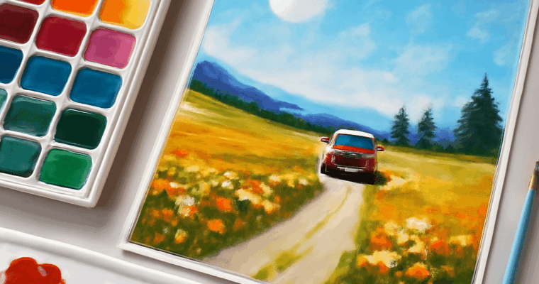
An artist’s medium is the material or method used to make an artwork. Learn how art mediums shape process, form, surface, scale, reproduction, and the viewer’s experience.