
Creative Bedroom Theme Ideas for a Designer Look
Explore creative bedroom theme ideas to transform your space with designer flair. Discover interior design tips and decorating ideas for a stylish bedroom.
Explore creative bedroom theme ideas to transform your space with designer flair. Discover interior design tips and decorating ideas for a stylish bedroom.

Discover simple house design concepts and styles that blend functionality with modern aesthetics. Learn how to create a home that suits your lifestyle.

A visitor encounters a print of sliced watermelons marked with a vivid Spanish phrase and wants to identify the work. The fruit in Kahlo’s Viva la Vida belongs to a still life in which color and writing share the foreground, turning an ordinary food into an unusually direct address to the viewer.
Frida Kahlo’s Viva la Vida is associated with her final days, but its painted fruit and later inscription have a more complex chronology. Looking at the arrangement first makes it easier to distinguish what is visible from what later viewers have imagined about her intentions.
The picture groups whole and cut watermelons on a dark surface under a blue, clouded sky. A large red half dominates the left foreground; behind it, green rinds form a cluster of rounded shapes. A smaller slice sits near the lower edge, carrying words across its red flesh. At right, a cut fruit opens into pointed pieces that break up the rounded forms elsewhere.
The arrangement gives the eye several paths through the picture. The exposed red draws attention first, then pale rind leads outward to the green skins. Dark seeds punctuate the flesh, while changes in shape and scale keep the fruit from becoming a flat decorative pattern. In Viva la Vida, Watermelons, the close grouping gives a simple still life a sense of abundance.
The work belongs to the Museo Frida Kahlo in Coyoacán, Mexico City, the house also known as the Blue House. Its subject is easy to recognize, yet Kahlo does more than record a collection of melons: she makes the cut surfaces face outward, placing color and inscription where they can command attention.
The contrast between green skin and red flesh gives the composition its immediate force. Pale bands of rind separate the two colors, making each cut edge legible even where shapes overlap. The dark surface beneath the fruit anchors the group, while the lighter sky opens the space above it.
Look at the whole fruit in the center and the sliced half at left. Their rounded contours relate to one another, but one offers a dark exterior and the other a broad field of red. The watermelon still life Viva la Vida gains its rhythm from that alternation: closed and open, smooth curve and irregular cut, dark rind and luminous flesh.
The small foreground wedge makes a different claim on the viewer. Its painted words interrupt the picture’s visual pattern, asking to be read as well as seen. The placement matters because the inscription is part of the fruit’s surface, rather than a caption set outside the image. It joins the act of looking at food to the act of reading a declaration.
The lettering reads “VIVA LA VIDA,” followed by Frida Kahlo’s name and “Coyoacán 1954 México.” The Spanish phrase means “Long live life.” The place and date locate the statement in the artist’s world; the words themselves give the still life its familiar title.
The Viva la Vida painting can therefore be approached on two levels. Its red and green shapes work as a composition even before the text is read. Once the words are noticed, the same wedge becomes a surface on which the artist’s voice enters the scene. The contrast between the ordinary fruit and the emphatic phrase is part of the picture’s lasting appeal.
A Mexican government account transcribes the sequence as “Viva la Vida, Frida Kahlo, Coyoacán 1954 – México.” Kahlo’s watermelon picture does not explain the sentence further, leaving space for a response grounded in what is actually there.
Kahlo died on July 13, 1954. The museum’s chronology says that she wrote the phrase on the watermelon picture days before her death. Its description of the work indicates that the fruit had been painted earlier and the words added years later. The inscription’s date should therefore not be taken as proof that every part of the image was painted in 1954.
The museum presents the late addition as a statement of resilience and hope. That is an interpretation informed by its place in Kahlo’s life, rather than a record of every thought she had while making the work. A viewer can recognize the force of the words without treating the picture as a complete account of her final feelings.
A concise identification such as “Frida Kahlo, Viva la Vida” helps distinguish this composition from her other fruit still lifes. Look for the grouped watermelons, the small inscribed foreground slice, and the blue sky: together they identify the work more reliably than a title shared in translation or an isolated detail.
Kahlo’s Viva la Vida watermelons invite attention to both arrangement and time. The exposed flesh suggests ripeness and food ready to be eaten; the rinds hold that vivid color inside solid, rounded forms. A reading of the picture may find associations with vitality or transience, but those meanings arise from the viewer’s encounter with the fruit and the phrase, not from a documented explanation attached to every detail.
The painting of Viva la Vida also shows how a brief addition can alter an existing image. The words sit among the seeds and cuts, making the earlier arrangement carry a later statement. In this watermelon painting by Kahlo, the visible relationship between text and fruit remains more specific and compelling than any single story imposed on the artist’s last days.
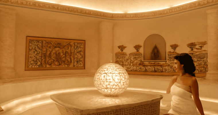
Explore the Turkish hammam, a traditional bathhouse offering a unique cleansing experience. Learn about its history, architecture, and cultural significance.

Discover the charm of modern farmhouse exteriors with design ideas, key features, and tips to create a perfect blend of rustic charm and contemporary style.
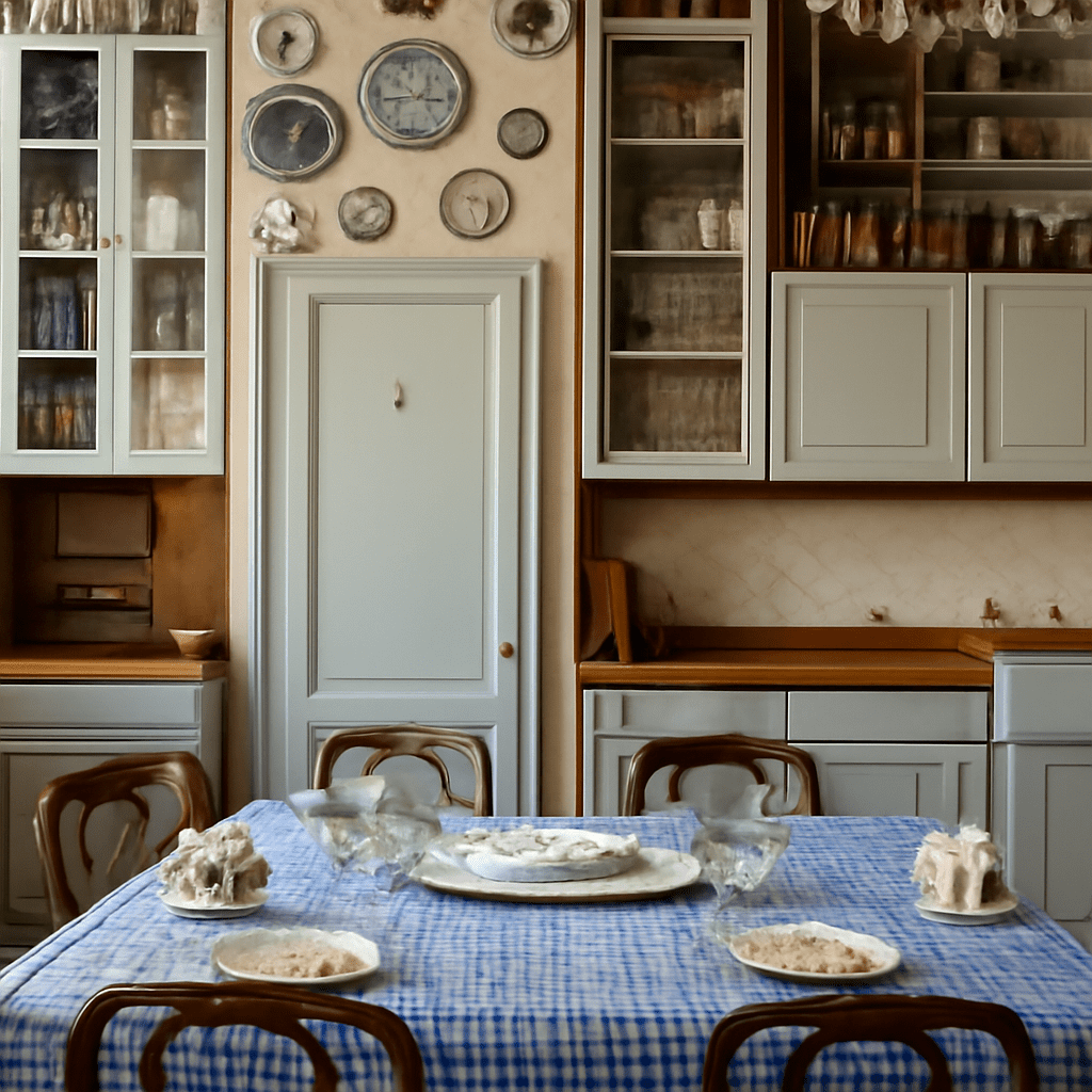
Decorating above kitchen cabinets can transform a mundane kitchen into an inviting and personalized space. Knowing how to decorate above kitchen cabinets effectively requires a blend of creativity and practicality. Whether you’re aiming for a stylish, functional, or lush aesthetic, there are plenty of options to explore. This guide will help you make the most of that often-overlooked space.
Before diving into decorating above kitchen cabinets, it’s essential to understand the space you’re working with. The area above cabinets is typically small and often narrow, making it crucial to choose items that don’t overwhelm the space. These spots are perfect for displaying decor that adds height to your room, creating an illusion of extended ceilings.
Consider the height of your ceilings and the depth of the available space. This will help determine the size and type of decor you can use. Remember that items placed here should complement the overall style of your kitchen, whether it’s modern, rustic, or traditional.
When deciding what to put above kitchen cabinets, consider items that not only enhance your kitchen’s aesthetic but also reflect your personality. Here are a few ideas to get you started:
Art and accents can serve as focal points above your cabinets. Here’s how to decorate the top of kitchen cabinets with these elements:
Plants are a wonderful way to bring life and color into your kitchen. When considering how to decorate above kitchen cabinets with plants, think about the light levels in your kitchen and choose appropriate species. Here are some options:
When arranging decor above your kitchen cabinets, keep these practical tips in mind for both safety and aesthetic appeal:
Decorating the space above kitchen cabinets is a chance to express creativity and add a personal touch to your kitchen. Use these ideas to create a harmonious and stylish environment, tailored to your taste and the style of your kitchen.

Explore the diverse types of interior design styles, current trends, and themes to transform your home. Stay updated with the latest home design trends and ideas.
Architecture and the golden ratio meet in famous façade diagrams. Learn how measurements, original records, and later overlays reveal what a claim actually shows.

A man stands with his back to the viewer, his boots planted on dark rock while pale fog conceals the valleys ahead. In Caspar David Friedrich’s mountain scene, the meaning of the lone wanderer overlooking the mist begins with that exchange between a stable point of view and a landscape that refuses to become fully clear.
Painted around 1817, Wanderer Above the Sea of Fog is also known as Wanderer Over the Sea of Mist. The work invites a close look at how a figure, a viewpoint, and an assembled landscape create an experience of both proximity and distance.
The figure occupies the center of a vertical canvas, dressed in a dark coat and holding a walking stick. His head interrupts the skyline, and his body obscures part of the view. The rocky ledge brings him close to the viewer, but his face is hidden, so his expression cannot settle the mood for us.
Art historians use the German term Rückenfigur for a figure seen from behind. As Smarthistory’s discussion explains, Friedrich used this device in other works as well. Here the man gives the viewer a direction to look, while remaining a separate presence with a view we cannot quite share.
In Wanderer Above the Sea of Fog, meaning emerges from this tension: the visitor can imagine standing near the traveler, yet the traveler also blocks the center of the scene. The painting holds identification and distance together. His upright posture might suggest confidence, contemplation, or exposure; the hidden face leaves those responses open.
The nearest rocks are dark, angular, and substantial. Beyond them, lighter veils of mist cover the lower ground, while isolated peaks and tree-covered ridges rise through the white. The contrast makes the foreground seem solid and the landscape beyond it difficult to measure.
A Wanderer Above the Sea of Fog analysis begins with those changes in visibility. The eye moves from the man’s boots toward the scattered summits, but the fog interrupts any continuous route through the picture. Some ridges are sharply defined; distant forms dissolve into blue-gray air. Space feels expansive because the viewer can see across it, and uncertain because much of its terrain remains hidden.
Friedrich drew on observations of mountain formations in the Elbe Sandstone region, but assembled elements from different views. The landscape is therefore a composed image rather than a single photographic record of a particular overlook. That distinction helps explain why individual rocks feel precise while the whole scene has the coherence of an imagined experience.
Friedrich worked within German Romanticism, a movement that explored emotion, imagination, and the relationship between human beings and nature. Mountain scenery could evoke the sublime: an encounter with scale or power that inspires awe and may also carry a sense of danger. The traveler’s smallness before the distant ranges supports such a reading, even though his large silhouette also commands the composition.
In Wanderer Above the Sea of Fog, meaning can be found in the contrast between the figure’s apparent stillness and the immensity beyond him. A wanderer above a sea of mist might appear to survey the world from a position of mastery, yet the obscured valleys and precarious ledge complicate that impression. The view offers no clear path to the horizon.
The Hamburger Kunsthalle dates the oil painting to about 1817. Its Romantic setting makes awe, reflection, and uncertainty useful ideas for interpreting the scene, but it does not prove one private emotion in the figure or one fixed intention in the artist’s mind.
The sitter’s identity remains uncertain. Scholars have proposed several possibilities, including a traveler, an image related to the artist, and a figure associated with the period’s military dress. The face gives no identifying evidence, and a particular name should not be presented as established fact. The man’s clothing and walking stick, however, make him a specific painted presence rather than a featureless symbol.
The figure in Wanderer Over the Sea of Fog also raises a practical question for interpretation: is he arriving at a summit, pausing on a journey, or looking toward an unknown destination? The canvas supplies a posture and a view, not an account of what came before. Those visible choices support readings of solitude or exploration without deciding the narrative.
The meaning of Friedrich’s wanderer above the fog changes with the detail that receives attention. The sharply edged rock can emphasize physical risk; the open sky and successive ridges can suggest possibility. Mist can be read as a boundary to knowledge, while the fact that some peaks remain visible keeps discovery in the picture.
An analysis of Wanderer Above the Sea of Fog is strongest when it returns to those visual facts. The traveler’s back directs the gaze, his body partially interrupts it, and the painted atmosphere both reveals and hides the landscape. Together they make the meaning of the wanderer in the sea of fog an invitation to contemplate a view whose full extent remains beyond sight.
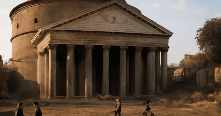
Uncover the history, architecture, and cultural significance of the Paris Pantheon, a stunning example of neoclassical design in the heart of Paris.