Author: Emily Griffith-Smith

Baroque Church Architecture: Its Defining Characteristics

Baroque Church Architecture: Its Defining Characteristics

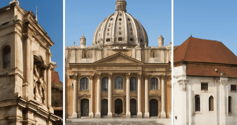
Baroque church architecture uses curved plans, layered facades, domes, controlled light, illusionistic ceilings, sculpture, and rich materials to turn worship into a dramatic experience across Europe.

Different Mediums of Art: A Practical Guide to Materials and Forms

Different Mediums of Art: A Practical Guide to Materials and Forms

Different mediums of art: define medium, material, technique, format, and genre, and compare drawing, painting, printmaking, photography, digital art, sculpture, performance, sound, and mixed media.

Nature Colors: How to Build Balanced Palettes from Natural Scenes

Nature Colors: How to Build Balanced Palettes from Natural Scenes

Build nature colors by recording relationships, not by copying every visible color. Start with the scene’s largest color mass, add supporting colors from nearby areas, reserve the strongest contrast for an accent, and use a neutral to control the result. This produces a usable nature palette for interiors, branding, illustration, or digital design.

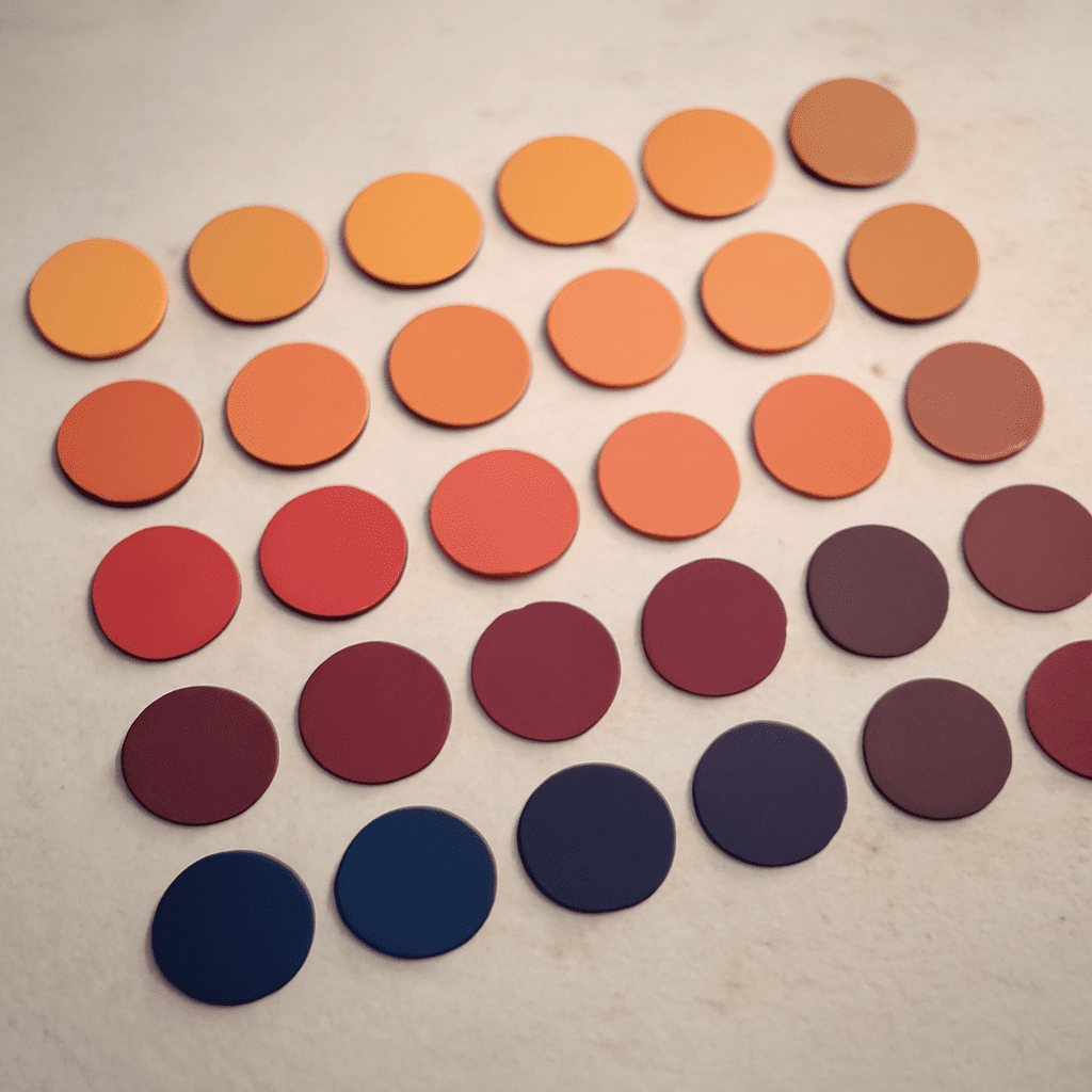
Sunsets make the method easy to see because they often combine intense warm light with cool atmospheric shadows. The goal is not to preserve every orange, pink, blue, and purple in the image. It is to decide which colors should occupy the most space, which should create structure, and which should attract attention.

Nature Colors: Read a Scene Before You Sample

Observe the scene at a distance before choosing swatches. Squint, blur the image, or reduce it to a small thumbnail. Details disappear and the dominant value masses become clear: perhaps a dark foreground, a luminous middle sky, and a narrow band of bright light near the horizon.

  1. Find the largest area. This is usually the sky, water, foliage, rock, or ground. Its color and value should guide the palette.
  2. Locate the visual support. Notice the colors that sit beside the dominant area and make it feel warmer, cooler, lighter, or darker.
  3. Identify the focal accent. Look for a small area with unusual brightness, saturation, or temperature, such as a sunlit cloud or red reflection.
  4. Notice what calms the scene. Haze, stone, sand, gray-blue shadow, and softened earth tones often serve as natural neutrals.

Sample from representative areas rather than isolated highlights. A tiny sun reflection may be almost white, but treating it as a major palette color will make the finished scheme harsh. Five considered colors are generally more useful than fifteen unweighted samples.

Build a Nature Palette with Four Color Roles

Assign each chosen color a job. These roles describe how colors behave in the scene and how much visual space they should occupy in a design. The percentages below refer to visual area, not the number of objects or swatches.

  • Dominant color: 45–60%. Choose the broadest field, such as muted blue sky, olive foliage, or a warm sand-colored shore. It establishes the palette’s atmosphere and should usually be moderate in saturation.
  • Supporting colors: 20–35% combined. Select one or two neighboring colors that explain variation in the scene. A lavender cloud bank may support a peach sky; a mossy green may support a deeper forest tone.
  • Accent color: 5–10%. Use the scene’s strongest point of contrast sparingly. Sunset accents might include coral, amber, or a concentrated red-orange glow. The accent should guide the eye rather than cover the design.
  • Neutral color: 10–25%. Choose a low-chroma color already present in the landscape, such as warm gray, fog, cream, charcoal, taupe, or blue-gray. It creates breathing room between more expressive hues.

These roles can overlap in hue but differ in value or saturation. For example, a sunset palette might use pale peach as the dominant, dusty rose as support, vivid tangerine as the accent, and deep blue-gray as the neutral. The neutral does not need to be gray; it only needs to be quiet enough to balance the brighter colors.

Balance Value, Temperature, and Saturation

Hue tells you whether a color is orange, blue, green, or violet, but hue alone does not create coherence. Compare every sample by value, temperature, and saturation before finalizing the palette.

  • Value: Include a clear light-to-dark range. If every color is light, the palette loses structure; if every color is dark, the scene feels heavy. A pale sky, middle-value support, and dark anchor create readable contrast.
  • Temperature: Balance warm colors with cool ones. Orange and rose can feel excessive when surrounded only by warm beige. A blue-gray, violet, or cool charcoal can make the warmth appear brighter without increasing saturation.
  • Saturation: Keep the most intense color limited. Reduce saturation in the dominant and supporting colors until the accent has room to work. This prevents a sunset palette from becoming uniformly bright.

A practical check is to view the palette in grayscale. If all the swatches merge, adjust their values before changing their hues. Then view them together at full color and mute any supporting color that competes with the accent. Preserve one or two colors close to neutral so the eye has somewhere to rest.

Four Sunset Palette Structures: Calm Wash, Dark Anchor, Warm Glow, and Dusk Fade

Use these structures as starting points rather than fixed swatches. Each one describes a different relationship among light, shadow, warmth, and neutral space.

  • Calm Wash: Allocate about 35% pale peach or soft apricot, 25% misty lavender, 20% blue-gray, 10% sandy neutral, and 10% muted coral. Keep all but the coral relatively soft in saturation. This scheme suits quiet interfaces, bedrooms, stationery, and airy editorial layouts.
  • Dark Anchor: Use 40% deep indigo or charcoal, 20% dusky violet, 15% burnt orange, 10% coral, and 15% warm gray. The dark dominant gives the sunset dramatic weight, while the warm accent stays small and luminous. Apply it to cinematic graphics, event branding, or a room with a strong focal wall.
  • Warm Glow: Build around 30% amber, 25% peach, 15% rose, 15% warm cream, and 15% muted brown. Let amber and peach carry most of the area, but lower their saturation slightly so the rose accent remains distinct. This is effective for welcoming hospitality, food, lifestyle, and celebratory designs.
  • Dusk Fade: Combine 30% blue-gray, 20% mauve, 20% plum, 15% charcoal, and 15% faded apricot. Keep the apricot as the only clear warm note or use it in a small highlight. The cool majority creates a restrained evening mood for packaging, fashion, and reflective digital compositions.

Test the selected structure in a simple composition or space before committing. Create three small layouts: one with the dominant color as the background, one with the neutral as the background, and one with the dark anchor behind the accent. Check text readability, focal order, and whether the accent still feels special. If the design looks loud, reduce saturation or increase neutral area; if it looks flat, strengthen the value difference between the dominant and supporting colors.

What’s My Decorating Style Quiz? Build a Practical Interior Direction

What’s My Decorating Style Quiz? Build a Practical Interior Direction

What’s my decorating style quiz? Score your choices for form, material, color, pattern, age, and visual density, then turn your strongest signals into a flexible palette, furniture, and object plan.

From Traditional Japanese House Layouts to Modern Japanese Architecture

From Traditional Japanese House Layouts to Modern Japanese Architecture

Learn how a traditional Japanese house layout uses genkan, tatami rooms, sliding partitions, and garden edges—and how modern Japanese architecture reworks these ideas.

Swiss Style Graphic Design: How the International Typographic Style Works

Swiss Style Graphic Design: How the International Typographic Style Works

Swiss Style graphic design is a method for making information easy to read through structure, not decoration. Its recognizable decisions include a modular grid, asymmetric composition, sans-serif type, flush-left alignment, controlled scale, generous whitespace, and objective photography.

Also known as the International Typographic Style, it developed in Switzerland during the 1950s and spread through corporate identity, posters, publishing, signage, and exhibition design. The result can look minimal, but minimalism alone does not define it: the essential feature is a disciplined relationship between content, alignment, typography, image, and space.

Swiss Style Graphic Design and the International Typographic Style

Swiss Style and the International Typographic Style describe the same broad movement. “Swiss Style” emphasizes its geographic and cultural roots; “International Typographic Style” reflects how its principles became an international visual language.

The movement grew from earlier modernist ideas associated with Bauhaus, Constructivism, and De Stijl, then took a particularly systematic form in Swiss schools and studios. Designers such as Josef Müller-Brockmann, Armin Hofmann, Emil Ruder, and Max Bill treated design as a communication problem. The designer’s task was to organize information clearly rather than express a personal style through ornament.

This explains the movement’s typical visual cues: a grid controls relationships, typography carries the message, photography presents evidence or subject matter directly, and asymmetry creates movement without sacrificing order. Each choice supports the others.

The Grid as an Organizing System

The grid is the structural foundation of Swiss design. It divides a page into columns, rows, margins, and intervals so that text, images, captions, and empty space can align even when their sizes differ.

A modular grid is more flexible than a simple set of equal columns. Its smaller units allow a headline to occupy two modules, a photograph to span four, and supporting text to sit in a narrower field. This creates consistent relationships across a poster series, magazine, identity system, or set of web pages.

Swiss layouts are often asymmetric. Instead of centering every element, the designer may anchor content to a vertical guide, leave a large area open, and place an image or block of type toward one side. The imbalance produces visual tension, while the shared guides prevent the composition from feeling random.

To apply the principle, establish the content hierarchy first, then choose a grid that can accommodate the longest heading, primary image, supporting copy, and necessary labels. Aligning every element to every guide is not the goal; using the grid to make deliberate relationships visible is.

Swiss Typography: Hierarchy, Spacing, and Alignment

Swiss typography usually relies on sans-serif typefaces because their forms remain legible at different sizes and reproduce consistently across applications. Helvetica is strongly associated with the movement, while Univers and Akzidenz-Grotesk also demonstrate the functional, restrained approach.

Type hierarchy comes from scale, weight, position, and spacing rather than decorative effects. A large headline can establish the entry point; a smaller lead, caption, or body block can supply detail. Limited type families and a small number of weights make those differences easier to perceive.

Flush-left alignment with a ragged right edge is common because it gives the reader a stable starting line. Centered or justified text can be used, but Swiss typography generally avoids alignment choices that weaken the reading rhythm or create distracting gaps.

Whitespace is an active part of the system. It separates levels of information, frames an image, and gives a large headline enough visual authority. Line length, leading, and paragraph spacing should be adjusted as a group: tighter spacing can bind related information, while a wider interval signals a change in level or subject.

Swiss Design: Photography, Color, and Asymmetric Composition

Photography in Swiss design is often objective: it shows a person, product, place, or process with limited manipulation and a clear informational purpose. A documentary image may be cropped firmly, enlarged dramatically, or placed against an open field, but it should still communicate its subject rather than function only as decoration.

Image treatment follows the grid. A photograph can act as the dominant scale element, align with a text column, or interrupt the grid at a deliberate point. Cropping is therefore not an afterthought; it determines what the viewer notices and how the image participates in the hierarchy.

Color is usually controlled rather than absent. Black, white, and neutral tones may be combined with one strong accent to mark a category, emphasize an instruction, or create contrast. Red is familiar in many Swiss posters, but no single palette defines the style. What matters is that color has a communicative role and does not compete with the information order.

Asymmetry, scale contrast, and open space create energy without visual clutter. A small caption beside a very large image, or a compact text block positioned against an expansive margin, can make the composition dynamic while the grid maintains coherence.

Swiss International Style: A Practical Recognition Method

When analyzing a composition, do not begin by asking whether it looks clean or modern. Trace the decisions in this order:

  1. Identify the information order. Decide what the viewer sees first, second, and third. A dominant headline, image, or number should have a clear reason for leading.
  2. Map the alignment. Look for repeated vertical and horizontal edges. Note which elements share a column, which cross a guide, and where the margins establish the field.
  3. Check hierarchy and scale. Compare type sizes, weights, image dimensions, and whitespace. Strong contrast should distinguish levels of information, not create arbitrary drama.
  4. Read the rhythm. Examine line lengths, leading, repeated intervals, and the spacing between groups. Consistent intervals often reveal the underlying grid even when guide lines are invisible.
  5. Assess image treatment. Ask whether the photography communicates a subject objectively, how it is cropped, and whether its placement supports the text rather than merely filling space.

To build a Swiss-style composition, assign each content element a role, place it on a modular grid, choose a restrained sans-serif system, and set a clear flush-left reading line. Introduce asymmetry through position or scale, then remove any element that does not improve hierarchy, alignment, rhythm, image treatment, or information order.

Hanging Artwork: Placement, Layout, and Secure Support

Hanging Artwork: Placement, Layout, and Secure Support

Hanging artwork well means balancing sightlines, furniture, spacing, and wall strength. Learn how to hang artwork with paper templates, measured offsets, rated hardware, and a final level check.

How Big Is a Fat Quarter of Fabric? Dimensions, Cut, and Variations

How Big Is a Fat Quarter of Fabric? Dimensions, Cut, and Variations

A fat quarter is usually about 18 by 22 inches in U.S. quilting cotton, but usable size can vary. See how it’s cut, how it differs from a quarter yard, and what to measure before sewing.

Graffiti Artists: Art, Styles, and the Art-or-Vandalism Debate

Graffiti Artists: Art, Styles, and the Art-or-Vandalism Debate

Graffiti artists use lettering, characters, stencils, and large-scale compositions to communicate identity, skill, humor, protest, or a relationship with a particular place. The same work can therefore be discussed as art for its visual and cultural qualities while still being treated as vandalism if it was made without permission.

Whether a work is considered art or vandalism depends on separate questions: how effectively it communicates, who authorized it, what property it affects, how much damage or maintenance it creates, and how local law defines unauthorized marking.

Graffiti Artists: Tags, Throw-Ups, Pieces, Stencils, Characters, and Murals

Graffiti styles differ in purpose, scale, speed, and visual complexity. Many artists move between forms, combining fast lettering with detailed images or adapting a style to the available surface.

  • Tags are personal signatures, usually made quickly with a marker or spray paint. Their value within graffiti culture often relates to distinct lettering, repetition, visibility, and the recognition an artist earns.
  • Throw-ups are larger, simplified names built from rounded or block letters, often using one fill color and an outline. They balance speed with greater visual presence than a tag.
  • Pieces, short for masterpieces, are elaborate letter compositions with fills, outlines, highlights, shading, and effects. They demand more planning, time, and control.
  • Stencil work uses cut templates to reproduce sharp symbols, images, or text. Stencils allow rapid execution and can make repeated motifs look deliberately uniform.
  • Characters include invented figures, portraits, mascots, and cartoon-influenced forms. They may support the lettering, carry the main message, or establish an artist’s recognizable visual language.
  • Murals are broad compositions designed for walls or other large surfaces. They may be commissioned, community-led, or unauthorized, and can combine lettering, characters, illustration, and abstract elements.

Working methods also shape the result. Artists may sketch in notebooks, plan color layers, paint with aerosol cans or rollers, work alone or with a crew, and choose a site for its visibility, texture, history, or symbolic meaning.

Representative Graffiti Artists: How TAKI 183, Dondi, Lady Pink, and Banksy Use Tags, Pieces, Characters, and Stencils

These artists represent different approaches rather than a single definition of graffiti. Their work shows how the form can prioritize name recognition, letter structure, personal identity, narrative imagery, or political intervention.

  • TAKI 183 became associated with the early New York tagging culture of the 1970s. His name and street number appeared across trains and city surfaces, demonstrating how a compact signature could function as both personal identity and a claim to visibility.
  • Dondi developed highly structured subway pieces in which letterforms, arrows, color, and movement worked as one composition. His whole-car works show how graffiti lettering can operate with the scale, rhythm, and planning associated with large-format painting.
  • Lady Pink brought detailed lettering and figurative imagery to New York’s subway and mural scenes. Her work is important not only for its technical range but also for challenging the male-dominated image of graffiti culture and making space for a distinct artistic voice.
  • Banksy is strongly associated with stencils that deliver visual jokes, political criticism, or emotional contrasts in a few quickly read elements. The placement of an image beside a wall, sign, or other urban feature is often part of the meaning.

The examples also complicate simple categories. A tag can have cultural importance without resembling a traditional painting, while a carefully executed stencil can be visually compelling even when its placement creates legal and civic conflict.

Is Graffiti Art? Aesthetic Merit, Cultural Meaning, and Site-Specific Reading

The question “is graffiti art?” can be answered through aesthetic and cultural evaluation, even when the legal status of a particular work remains disputed. Viewers can assess line quality, composition, color relationships, scale, originality, technical control, and the clarity of an image or message. These criteria apply whether a work appears in a gallery, on a permitted mural wall, or in a less conventional urban setting.

Graffiti can also carry cultural meaning that is not captured by appearance alone. A tag may record presence in a neighborhood, a piece may reflect a crew’s shared identity, and a political stencil may challenge who controls public visual space. The work’s location can add meaning: a painted train suggests movement and reach, while a neglected wall may frame a piece as an intervention in an overlooked area.

Site-specific reading does not require viewers to approve the method of installation. A work can be historically important, skillful, or culturally influential without receiving permission. Likewise, a permitted mural can be artistically weak. Artistic merit and authorization are related to public reception, but neither one automatically determines the other.

Graffiti Art or Vandalism? Permission, Property Damage, Maintenance, Public Impact, and Local Law

The phrase “graffiti art or vandalism” describes a debate that combines different standards. As an aesthetic question, people may ask whether the work is inventive, skillful, meaningful, or valuable to a community. As a property and legal question, they ask whether the artist had consent and whether the marking altered someone else’s property without authorization.

Unauthorized painting, etching, writing, or adhesive application is commonly treated as vandalism or criminal damage, although definitions and penalties vary by jurisdiction. A work’s artistic quality generally does not make an unauthorized act legally permitted. Public ownership does not automatically mean public permission: a city wall, bridge, transit vehicle, utility box, or monument may have a specific owner, manager, or set of restrictions.

Property impact includes more than the visible image. Paint can cover signs, damage historic surfaces, obstruct maintenance information, or require specialized removal. Cleaning may involve labor, solvents, repainting, traffic control, or repeated treatment when a site attracts more marking. Those costs can affect owners, transit systems, local governments, and residents who never agreed to display the work.

Public response is also shaped by location and consent. Residents may welcome a permitted mural that reflects local history but object to a piece placed over a storefront, memorial, directional sign, or another artist’s work. A wall owner, mural program, or public agency can establish permission through a written agreement, permit, approved design, surface limits, and rules about duration or maintenance. Without that authorization, artistic discussion can continue, but the work may still be treated as vandalism under local law.

Stained Glass Designs: How to Draw a Workable Window Pattern

Stained Glass Designs: How to Draw a Workable Window Pattern

Stained glass designs become workable window patterns through measured drawing, clear lead lines, numbered pieces, balanced color, and checked support structure before glass is cut.