Author: Emily Griffith-Smith

Types of Quilt Patterns: From Traditional Blocks to Modern Designs

Types of Quilt Patterns: From Traditional Blocks to Modern Designs

Learn the main types of quilt patterns, from repeated pieced blocks and appliqué to medallions, rows, whole-cloth work, and improvisation—and see how scale, color, and negative space shape each design.

Blue Color Combinations That Stay Balanced

Blue Color Combinations That Stay Balanced

Learn how to use blue color combinations with light, muted, saturated, and dark blues. Pair them with neutrals, complements, and warm accents. Balance undertone, value, saturation, and proportion.

Christmas Color Palettes Beyond Red and Green

Christmas Color Palettes Beyond Red and Green

A successful Christmas color palette depends less on using familiar festive shades than on controlling their relationships. Red and green can feel traditional, while navy, clay, blush, or charcoal can feel equally seasonal when hue, value, saturation, and proportion work together.

Use one dominant color, one supporting color, a generous neutral, and one restrained accent. This structure keeps Christmas colours coherent across a screen, printed piece, room, table setting, or handmade object.

Christmas Color Palettes: Start with Hue, Value, and Neutrals

Build a palette by assigning each color a clear job:

  • Hue relationship: Complementary hues sit opposite each other on the color wheel, as red and green do, creating lively contrast. Analogous hues sit beside each other, such as evergreen, moss, and eucalyptus, for a quieter botanical effect.
  • Value contrast: Value describes how light or dark a color appears. Pairing a deep green with pale ivory gives definition; pairing several mid-value colors can look flat unless a light or very dark neutral separates them.
  • Saturation: Highly saturated colors are vivid and energetic. Muted versions contain more gray or brown and feel softer, older, or more natural. Limit strong saturation to one or two colors so the palette does not become noisy.
  • Neutral balance: Ivory, charcoal, stone, oatmeal, gray, and white give the eye somewhere to rest. A neutral can occupy 25 to 50 percent of the palette without making it feel less festive.

A useful starting proportion is 50 percent dominant color, 30 percent supporting color, 15 percent neutral, and 5 percent accent. Adjust those figures when the medium demands it, but keep the accent controlled. Metallic-like gold, silver, or copper usually works best as a small highlight rather than a fourth dominant hue.

Why Red and Green Became the Familiar Christmas Pair

Red and green work because they provide immediate hue contrast: their complementary relationship makes both colors appear more vivid. They also combine a dark, cool-to-neutral green with a naturally attention-grabbing warm red, creating useful value and temperature contrast.

The pairing is reinforced by seasonal natural forms. Evergreen foliage supplies persistent green, while berries, fruit, and winter decorations provide red. Over time, these associations were repeated in decorative traditions and popular imagery, making the combination instantly recognizable. It is not the only Christmas color palette, but it is a strong base that can be softened with cream, darkened with burgundy, or refreshed with a restrained metallic accent.

Five Palette Structures: Traditional, Winter, Botanical, Jewel, and Contemporary

These five Christmas color palettes use different hue relationships and levels of contrast. The proportions are starting points, not rigid formulas.

Traditional: Evergreen green (45%, dark and moderately saturated), cranberry red (20%, medium-dark and warm), warm ivory (25%, light neutral), and antique gold (10%, muted accent). The complementary green and red provide the seasonal identity, while ivory prevents the pair from becoming visually dense. Use gold sparingly for emphasis.

Winter: Midnight navy (35%, dark), icy blue (25%, light and cool), soft white (30%, very light neutral), and silver gray (10%, low-saturation accent). This is a cool, high-value-contrast palette. Navy replaces green as the anchor, while icy blue and white create an open, snowy impression without relying on bright red.

Botanical: Moss green (35%, medium and muted), eucalyptus (25%, light and gray-green), oatmeal (25%, warm neutral), and muted clay (15%, earthy accent). The neighboring green hues create an analogous relationship. Clay adds warmth without the sharp contrast of true red, making this structure suitable for natural, relaxed designs.

Jewel: Emerald (30%, deep and saturated), ruby (20%, rich warm red), deep teal (20%, dark blue-green), amethyst (15%, saturated violet), and champagne (15%, light metallic-like neutral). Several colors are vivid, so the dark values and limited champagne prevent visual competition. Let emerald or teal lead, rather than giving every jewel tone equal weight.

Contemporary: Charcoal (35%, dark neutral), sage (25%, muted green), dusty blush (20%, soft warm hue), paper white (15%, light neutral), and copper (5%, controlled accent). This low-to-medium saturation scheme feels current because the neutral does most of the structural work. Copper should appear only where a small focal detail is needed.

Adjust Color Proportions for Screens, Print, Rooms, Tables, and Handmade Objects

  • Screens: Choose digital colors in a consistent RGB or sRGB workflow and check them on both bright and dim displays. Preserve clear light-dark contrast for text and interfaces; a vivid accent can be reduced to 5 percent so it does not dominate a small screen.
  • Printed pieces: Expect ink, paper, and coating to alter saturation. Deep greens, navy, and violet may print darker or duller than they appear on screen, so make a physical proof. Use a larger neutral area to keep fine type and small details legible.
  • Rooms: Apply the palette as an approximate 60-30-10 distribution: a dominant wall or large-surface color, a supporting furnishing or textile color, and a small accent. Repeat the accent in more than one location so it feels intentional rather than isolated.
  • Tables: Let the cloth, ceramics, or table surface provide most of the neutral balance. Repeat the dominant color through several small elements, then reserve the accent for a narrow band of detail. This keeps the setting festive without making every object compete.
  • Handmade objects: Limit the palette to three or four reliable materials or pigments when color variation is difficult to control. Test the colors together, repeat each important hue at least twice, and simplify the accent if the object is small or intricately patterned.
What Is an Artist’s Medium? How Art Mediums Shape Possibility

What Is an Artist’s Medium? How Art Mediums Shape Possibility

An artist’s medium is the material or method used to make an artwork. Learn how art mediums shape process, form, surface, scale, reproduction, and the viewer’s experience.

Southwestern Decorating Ideas: Space, Materials, Color, and Craft

Southwestern Decorating Ideas: Space, Materials, Color, and Craft

Explore southwestern decorating ideas through climate-responsive architecture, plaster, timber, clay, leather, wool, and desert color. Use substantial furniture, textiles, art, and craft to shape a contemporary room.

Different Types of Art Mediums: A Practical Visual Guide

Different Types of Art Mediums: A Practical Visual Guide

Different types of art mediums are defined by the material, tool, or process used to make an artwork. Drawing uses marks, painting applies pigment, photography records light, sculpture occupies space, and performance unfolds through live action. Understanding these categories makes it easier to identify what an artwork is made from and how it works.

The terms medium, material, and technique overlap, but they are not interchangeable. The medium is the broad art-making form; the material is the physical substance; and the technique is the method used to shape it.

Different Types of Art Mediums: Medium, Material, Technique, Format, Genre, and Subject

An art medium is the primary means through which an artist creates an artwork. Drawing, painting, printmaking, photography, sculpture, film, and performance are all media. “Media” is the plural of “medium,” so types of media in art means the different forms or processes artists use.

A material is what the work physically consists of. Graphite, ink, canvas, oil paint, wood, clay, fabric, light, and recorded sound are materials. A technique is the action used to control a material, such as cross-hatching with graphite, glazing with oil paint, carving wood, throwing clay, or weaving thread.

A format describes the work’s presentation or shape: a mural, portrait, poster, book, video, site-specific work, or digital file. A genre identifies a conventional category or subject area, such as still life, landscape, portraiture, documentary, or science fiction. The subject is what the work depicts or addresses, such as a person, place, event, memory, or political issue. These labels can describe the same artwork without replacing its medium.

Types of Media in Art: Drawing, Painting, and Printmaking

Drawing is a two-dimensional medium based on lines, tones, and marks applied to a surface. Common materials include graphite, charcoal, colored pencil, pastel, ink, and chalk. A graphite portrait on paper is a direct example: the paper is the support, graphite is the material, and shading or cross-hatching is the technique.

Painting uses liquid or spreadable pigment on a surface. The medium may be oil, acrylic, watercolor, gouache, or tempera, while canvas, wood panel, paper, or wall serves as the support. For example, an acrylic mural combines acrylic paint with the technique of layering broad brushstrokes across a large wall.

Printmaking creates impressions by transferring ink from a prepared surface, or matrix, to paper or another material. Relief printing cuts away part of a wood or linoleum block; etching uses an incised metal plate; lithography relies on a treated stone or plate; and screen printing pushes ink through a stencil. A limited-edition linocut poster is a clear printmaking example because the carved block and repeated transfer process define the work.

These are primarily two-dimensional media, but their surfaces and processes differ. A drawing is usually made directly on its support, a painting builds an image with pigment, and a print is transferred from a matrix.

Examples of Art Mediums: Photography, Film, and Digital Art

Photography is a lens-based medium that records light through a camera onto film or an electronic sensor. Its materials may include photosensitive film, photographic paper, or digital data. A black-and-white street photograph made with a film camera is defined by the capture and development of light-sensitive film, not simply by its monochrome appearance.

Film and video are time-based, lens-based media that arrange moving images, sound, duration, and editing. A short documentary is an example of film: its medium includes recorded images and audio organized into a sequence. The final format might be a digital video file or a cinema screening, while documentary is the genre.

Digital art uses computer code, digital tools, sensors, or electronic displays as part of its making or presentation. A digitally painted illustration made with a tablet and stylus is one example. Other forms include 3D modeling, generative art, animation, interactive websites, and projection-based work. A digital file is a format; the software, code, interface, or electronic process helps define the medium.

Sculpture, Ceramics, Textiles, and Installation

Sculpture is a three-dimensional medium concerned with volume, mass, surface, and space. Artists may carve stone or wood, model wax or clay, cast metal, assemble found objects, or construct with glass and plastic. A carved marble figure is a sculpture because subtractive carving shapes a solid material into a form; an assembled steel structure uses a different material and process within the same broad medium.

Ceramics centers on clay shaped by hand, wheel, mold, or construction and then hardened through firing. A wheel-thrown stoneware bowl is a representative example. Its clay body, glaze, and kiln firing are more specific than the general category of sculpture, although ceramic objects can be sculptural rather than functional.

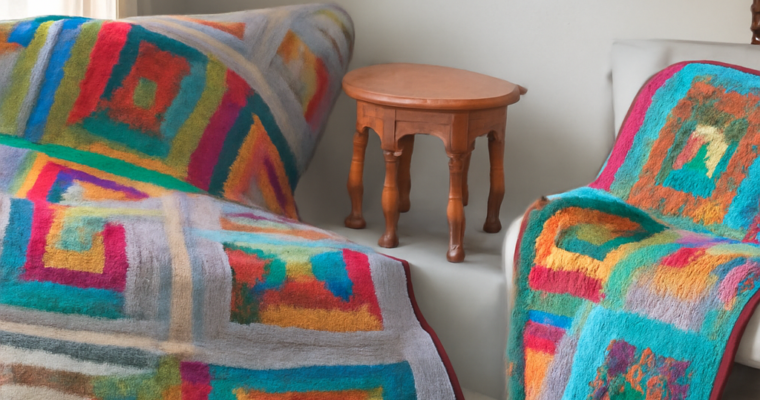
Textile art uses fibers and flexible surfaces through weaving, sewing, knitting, embroidery, quilting, dyeing, or knotting. An embroidered wall hanging combines fabric, thread, and stitched marks. Installation is a spatial medium in which objects, materials, light, sound, or architecture are arranged for a particular environment. For example, a room filled with hanging fabric, dim light, and recorded voices creates an installation that viewers experience by moving through it.

Performance, Sound, and Mixed Media

Performance art uses the artist’s body, actions, presence, and duration as its main medium. A live work in which an artist repeatedly folds and unfolds a flag for one hour is defined by the action and its time-based encounter with an audience. Photographs or video may document it, but documentation is not automatically the performance itself.

Sound art uses recorded audio, live voices, instruments, field recordings, electronics, or silence. A gallery work that plays layered recordings of harbor machinery through directional speakers is a sound-based artwork. The speakers and room affect the presentation, but the organized audio and listening experience are central.

Mixed-media art combines two or more distinct media in one work, such as paint, collage, photography, fabric, and found objects. A canvas with acrylic paint, pasted newspaper, stitched thread, and a mounted photograph remains identifiable through each component’s role. Interdisciplinary art can extend this approach by combining visual art with architecture, science, theater, dance, code, or sound. Combining media does not erase their differences: the paint still produces a surface, the photograph still records or presents an image, and the sound still operates through duration and listening.

Greek Column Styles: Doric, Ionic, and Corinthian

Greek Column Styles: Doric, Ionic, and Corinthian

Greek column styles become easy to spot: compare Doric, Ionic, and Corinthian bases, shafts, capitals, fluting, proportions, and entablature clues, with a reliable identification sequence.

Greek Column Types: Doric, Ionic, and Corinthian Compared

Greek Column Types: Doric, Ionic, and Corinthian Compared

Greek column types are easiest to identify as complete systems of base, shaft, capital, and entablature. Learn the classical orders. Compare Doric and Ionic with Corinthian forms.

Spanish-Style Homes: Architecture and Interior Design

Spanish-Style Homes: Architecture and Interior Design

Spanish style homes are a broad family of regional and revival traditions, not one fixed historical template. Their most recognizable quality is the connection between climate-responsive architecture and a tactile interior: stucco or plaster, clay tile, shaded openings, courtyards, timber, iron, and warm natural surfaces work together rather than appearing as unrelated decoration.

Spanish architecture homes may borrow from several periods and places, while Spanish style interior design translates the same ideas into proportion, light, texture, and craft. The result can feel informal, cool, sheltered, and connected to outdoor space without reproducing every historic detail.

Spanish-Style Homes: Regional Roots and Revival Variations

The term Spanish-style covers a range of interpretations. A house may draw from vernacular buildings in Spain, Spanish Colonial architecture in the Americas, or later Spanish Revival designs. These influences overlap, but they are not interchangeable. Spanish Colonial traditions developed in specific colonial regions and often reflect local materials and building methods. Mission Revival commonly simplifies the forms associated with California missions. Mediterranean Revival is a broader modern category influenced by several coastal cultures, while Pueblo traditions have distinct Indigenous roots and should not be treated as a Spanish substitute.

For that reason, a Spanish-style home is better identified by a combination of features than by a checklist. A low, grounded silhouette, stucco walls, clay roof tile, recessed windows, an arcade, and a courtyard create a recognizable family resemblance. The exact mix depends on location, period, climate, and whether the design is a revival interpretation or a closer historical reference.

Exterior Form: Stucco, Tile Roofs, Openings, and Courtyards

Exterior form establishes the style before any decorative detail is added. Stucco gives walls a continuous, mineral surface that can appear thick and protective. White, cream, sand, ochre, and muted earth tones are common, although regional examples may use stronger color. Clay tile roofs, often barrel-shaped or low-pitched, add weight and a warm counterpoint to the walls. Roof tile also suits climates where shade, thermal mass, and durable materials matter.

Openings are typically deep-set rather than flush with the facade. Recessed windows, heavy wood shutters, small openings, and covered porches reduce direct sun and create stronger shadow lines. Arches may frame doors, windows, passageways, or arcades, but their purpose is spatial as well as visual: they create a gradual transition between bright exterior areas and sheltered rooms.

Courtyards extend that transition. Instead of treating the garden as a separate view beyond the house, the plan can wrap around a protected outdoor room. An arcade, covered walkway, fountain, planted bed, or tiled floor gives the courtyard a sense of enclosure. Indoors, this arrangement produces rooms oriented toward filtered light, airflow, and repeated views of textured walls, greenery, and tile.

Spanish-Style Interior Design: Plaster, Timber, Tile, and Texture

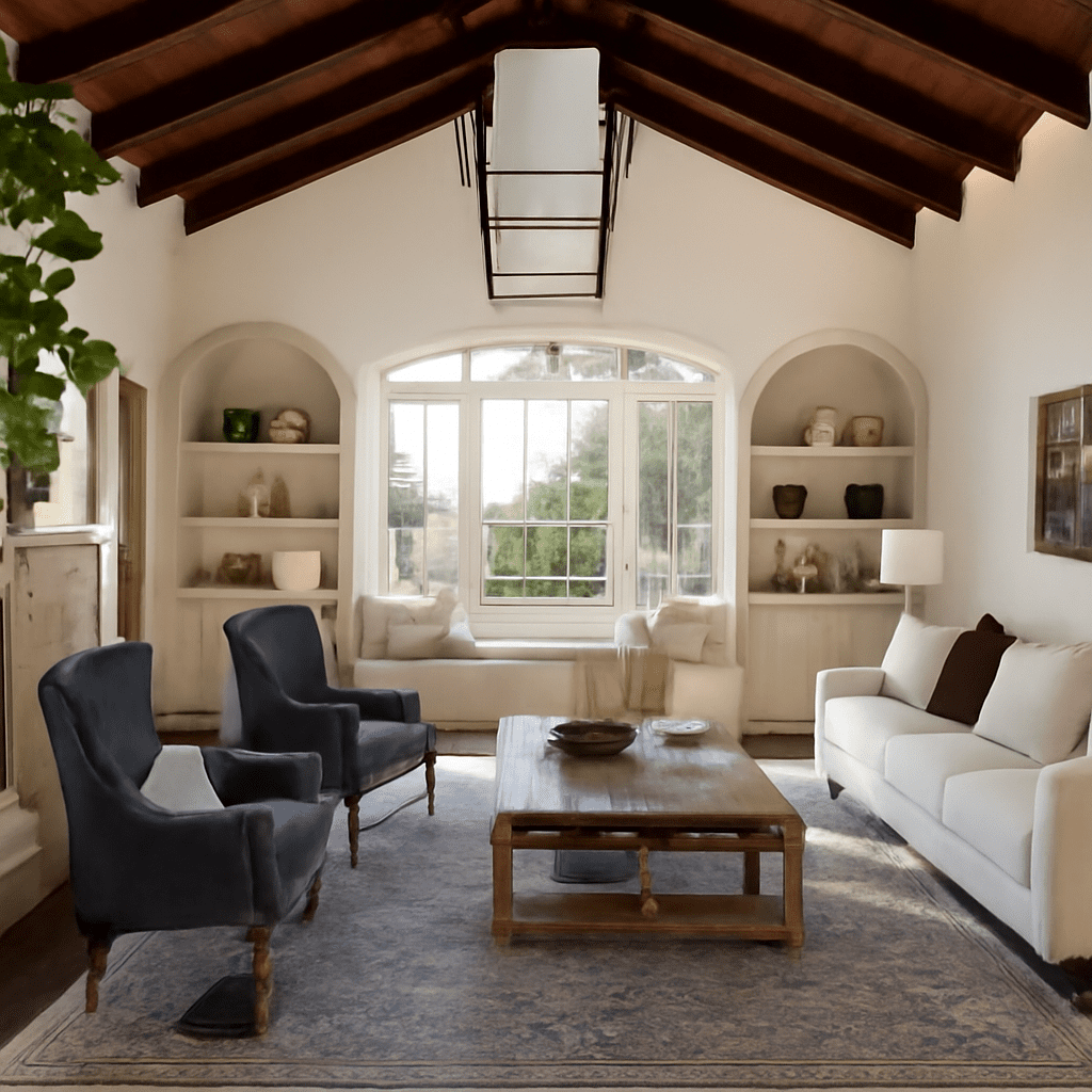
Spanish style interior design carries the exterior’s sense of mass and shelter indoors. Walls may be finished in smooth or lightly irregular plaster rather than crisp, highly reflective paint. Limewashed whites, warm neutrals, terracotta, tobacco brown, and muted blue or green create a grounded palette. Texture matters because it changes how sunlight moves across a room: a hand-finished wall can make a simple space feel more substantial without adding visual clutter.

Timber introduces warmth and structure. Exposed beams, ceiling boards, wide-plank floors, carved doors, and built-in cabinetry can contrast with pale plaster. The wood does not need to look heavily distressed; a restrained finish often shows the grain more clearly and keeps the room from becoming theatrical. Tile may continue from an entry or courtyard into a kitchen, hall, or bathroom, visually linking indoor and outdoor zones.

Spatial character is equally important. Thick-looking walls, deep doorways, niches, benches, and low transitions make rooms feel sheltered and connected. Furnishings usually work best when they leave those architectural surfaces visible. A leather chair, woven textile, stone table, or simple linen curtain can reinforce the atmosphere more effectively than a room filled with overtly themed accessories.

Craft Details: Patterned Tile, Timber, and Ironwork

Craft details give Spanish-style homes their close-range interest. Patterned tile can define a stair riser, fireplace surround, backsplash, entry floor, or courtyard border. Hand-painted and geometric patterns are especially effective when used in a controlled area, with surrounding surfaces kept quiet. Terracotta tile, whether patterned or plain, adds variation through its irregular edges, matte finish, and natural color shifts.

Ironwork appears in grilles, balconies, stair rails, door hardware, lanterns, and window guards. Its dark lines provide contrast against stucco and plaster, while an open grille can add security or shade without becoming visually heavy. Timber doors and beams bring another layer of craft through visible joints, simple carving, pegs, or iron straps. These materials feel related because each is durable, tactile, and capable of aging with character.

Adapt the Style Without Turning It Into a Theme

A contemporary interpretation should begin with proportion and material rather than copied motifs. Use a limited palette of plaster, wood, tile, iron, and stone, then let natural light reveal their differences. A plain arched opening may contribute more than several decorative arches, especially when it aligns a room with a courtyard or frames a shaded view.

  • Begin with the envelope: Choose stucco-like walls, deep reveals, a sheltered entry, or a tiled roof form before adding accessories.
  • Repeat materials thoughtfully: Carry one tile, timber, or iron finish from the exterior into an entry, kitchen, or passage so the house feels coherent.
  • Control pattern: Give patterned tile one focal location and balance it with quiet plaster, solid textiles, and simple furniture.
  • Use shade as a design tool: Layer shutters, curtains, arcades, pergolas, and recessed openings to create the changing light associated with the tradition.

The strongest result is specific without being literal: a house with grounded proportions, shaded thresholds, handmade surfaces, and a clear relationship between rooms and outdoor space. Those qualities preserve the character of Spanish-style homes while allowing the architecture and interior to belong to the present.

Prairie Architecture: How Frank Lloyd Wright Shaped Space

Prairie Architecture: How Frank Lloyd Wright Shaped Space

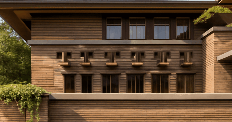
Learn how prairie architecture took shape in the Midwest and how Frank Lloyd Wright developed its language through low forms, broad eaves, open plans, central hearths, and integrated interiors.