Nature Colors: How to Build Balanced Palettes from Natural Scenes
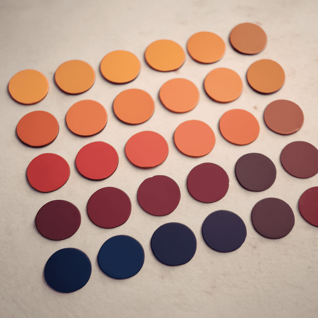
Build nature colors by recording relationships, not by copying every visible color. Start with the scene’s largest color mass, add supporting colors from nearby areas, reserve the strongest contrast for an accent, and use a neutral to control the result. This produces a usable nature palette for interiors, branding, illustration, or digital design.
Sunsets make the method easy to see because they often combine intense warm light with cool atmospheric shadows. The goal is not to preserve every orange, pink, blue, and purple in the image. It is to decide which colors should occupy the most space, which should create structure, and which should attract attention.
Nature Colors: Read a Scene Before You Sample
Observe the scene at a distance before choosing swatches. Squint, blur the image, or reduce it to a small thumbnail. Details disappear and the dominant value masses become clear: perhaps a dark foreground, a luminous middle sky, and a narrow band of bright light near the horizon.
- Find the largest area. This is usually the sky, water, foliage, rock, or ground. Its color and value should guide the palette.
- Locate the visual support. Notice the colors that sit beside the dominant area and make it feel warmer, cooler, lighter, or darker.
- Identify the focal accent. Look for a small area with unusual brightness, saturation, or temperature, such as a sunlit cloud or red reflection.
- Notice what calms the scene. Haze, stone, sand, gray-blue shadow, and softened earth tones often serve as natural neutrals.
Sample from representative areas rather than isolated highlights. A tiny sun reflection may be almost white, but treating it as a major palette color will make the finished scheme harsh. Five considered colors are generally more useful than fifteen unweighted samples.
Build a Nature Palette with Four Color Roles
Assign each chosen color a job. These roles describe how colors behave in the scene and how much visual space they should occupy in a design. The percentages below refer to visual area, not the number of objects or swatches.
- Dominant color: 45–60%. Choose the broadest field, such as muted blue sky, olive foliage, or a warm sand-colored shore. It establishes the palette’s atmosphere and should usually be moderate in saturation.
- Supporting colors: 20–35% combined. Select one or two neighboring colors that explain variation in the scene. A lavender cloud bank may support a peach sky; a mossy green may support a deeper forest tone.
- Accent color: 5–10%. Use the scene’s strongest point of contrast sparingly. Sunset accents might include coral, amber, or a concentrated red-orange glow. The accent should guide the eye rather than cover the design.
- Neutral color: 10–25%. Choose a low-chroma color already present in the landscape, such as warm gray, fog, cream, charcoal, taupe, or blue-gray. It creates breathing room between more expressive hues.
These roles can overlap in hue but differ in value or saturation. For example, a sunset palette might use pale peach as the dominant, dusty rose as support, vivid tangerine as the accent, and deep blue-gray as the neutral. The neutral does not need to be gray; it only needs to be quiet enough to balance the brighter colors.
Balance Value, Temperature, and Saturation
Hue tells you whether a color is orange, blue, green, or violet, but hue alone does not create coherence. Compare every sample by value, temperature, and saturation before finalizing the palette.
- Value: Include a clear light-to-dark range. If every color is light, the palette loses structure; if every color is dark, the scene feels heavy. A pale sky, middle-value support, and dark anchor create readable contrast.
- Temperature: Balance warm colors with cool ones. Orange and rose can feel excessive when surrounded only by warm beige. A blue-gray, violet, or cool charcoal can make the warmth appear brighter without increasing saturation.
- Saturation: Keep the most intense color limited. Reduce saturation in the dominant and supporting colors until the accent has room to work. This prevents a sunset palette from becoming uniformly bright.
A practical check is to view the palette in grayscale. If all the swatches merge, adjust their values before changing their hues. Then view them together at full color and mute any supporting color that competes with the accent. Preserve one or two colors close to neutral so the eye has somewhere to rest.
Four Sunset Palette Structures: Calm Wash, Dark Anchor, Warm Glow, and Dusk Fade
Use these structures as starting points rather than fixed swatches. Each one describes a different relationship among light, shadow, warmth, and neutral space.
- Calm Wash: Allocate about 35% pale peach or soft apricot, 25% misty lavender, 20% blue-gray, 10% sandy neutral, and 10% muted coral. Keep all but the coral relatively soft in saturation. This scheme suits quiet interfaces, bedrooms, stationery, and airy editorial layouts.
- Dark Anchor: Use 40% deep indigo or charcoal, 20% dusky violet, 15% burnt orange, 10% coral, and 15% warm gray. The dark dominant gives the sunset dramatic weight, while the warm accent stays small and luminous. Apply it to cinematic graphics, event branding, or a room with a strong focal wall.
- Warm Glow: Build around 30% amber, 25% peach, 15% rose, 15% warm cream, and 15% muted brown. Let amber and peach carry most of the area, but lower their saturation slightly so the rose accent remains distinct. This is effective for welcoming hospitality, food, lifestyle, and celebratory designs.
- Dusk Fade: Combine 30% blue-gray, 20% mauve, 20% plum, 15% charcoal, and 15% faded apricot. Keep the apricot as the only clear warm note or use it in a small highlight. The cool majority creates a restrained evening mood for packaging, fashion, and reflective digital compositions.
Test the selected structure in a simple composition or space before committing. Create three small layouts: one with the dominant color as the background, one with the neutral as the background, and one with the dark anchor behind the accent. Check text readability, focal order, and whether the accent still feels special. If the design looks loud, reduce saturation or increase neutral area; if it looks flat, strengthen the value difference between the dominant and supporting colors.