Recent Posts

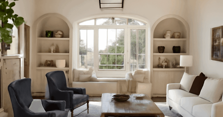
Southwestern Decorating Ideas: Space, Materials, Color, and Craft

Southwestern Decorating Ideas: Space, Materials, Color, and Craft

Explore southwestern decorating ideas through climate-responsive architecture, plaster, timber, clay, leather, wool, and desert color. Use substantial furniture, textiles, art, and craft to shape a contemporary room.

Different Types of Art Mediums: A Practical Visual Guide

Different Types of Art Mediums: A Practical Visual Guide

Explore different types of art mediums, from drawing and painting to photography, digital art, sculpture, and sound. Learn what material or process defines each, with examples of mixed-media work.

Greek Column Styles: Doric, Ionic, and Corinthian

Greek Column Styles: Doric, Ionic, and Corinthian

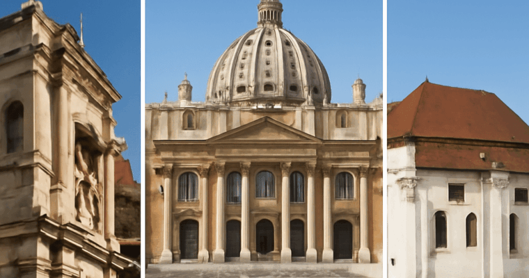
The Greek column styles most commonly identified in classical architecture are Doric, Ionic, and Corinthian. You can usually distinguish them by starting at the bottom: check whether the shaft has a base, how slender it is, and how its fluting is shaped. Then inspect the capital and the entablature above it.

The three types of Greek columns overlap in later buildings, so a capital alone can mislead. A plain capital is not automatically Doric, and a leafy capital is not necessarily an original Greek Corinthian example. Use several visible features together, especially when examining Roman copies, neoclassical buildings, or mixed designs.

Greek Column Styles: First Check the Base and Proportions

Begin at the column’s lowest visible point. In the canonical Greek orders, a Doric column generally rises directly from the stylobate, or stepped platform, without a separate base. Ionic and Corinthian columns normally stand on a molded base made from rounded and sometimes square-edged profiles. Later architects sometimes gave Doric columns bases, so this is a strong clue rather than an absolute rule.

Next, compare height with width. Doric shafts look comparatively sturdy and carry a strong visual weight. Ionic shafts are taller and more slender, while Corinthian shafts are usually at least as slender as Ionic ones. Look also at the fluting: vertical grooves make the shaft appear lighter, but their number and profile can vary between periods and buildings.

  • Doric: usually no separate base, sturdy shaft, simple capital, and often about 20 broad flutes.
  • Ionic: molded base, slender shaft, typically 24 flutes, and a capital with scroll-like volutes.
  • Corinthian: molded base, slender shaft, often finely fluted, and a deep capital covered with acanthus leaves.

Also scan above the capital. Doric entablatures commonly show alternating triglyphs and metopes in the frieze. Ionic entablatures more often use a continuous sculpted or plain frieze. Corinthian entablatures generally follow Ionic patterns, although later versions may be much more elaborate.

Doric Columns: Plain Capitals and Sturdy Proportions

Doric columns are the most visually weighty of the three principal Greek orders. Their shafts taper subtly toward the top and usually have broad, sharply cut flutes separated by narrow arrises. The shaft typically meets the stylobate without a distinct base, creating a direct, grounded appearance.

The Doric capital has two main visible parts. The lower echinus is a rounded, cushion-like molding; above it sits the square abacus, which supports the entablature. From a distance, the capital may look plain, but its curved echinus and squared abacus are important identifying details. It is not simply an undecorated block.

Above the capital, the frieze is often the clearest supporting clue. Triglyphs are vertically grooved blocks, usually placed between sculpted or plain metopes. If a column has a sturdy shaft, no obvious base, an echinus-and-abacus capital, and a triglyph-and-metope frieze, Doric is the strongest match.

Ionic Columns: Volutes, Bases, and Slender Shafts

Ionic columns are recognized most quickly by their volutes: paired spiral scrolls that project from the capital. Viewed from the front, the volutes resemble coiled disks; viewed from the side, the capital may appear narrow. This directional quality matters because an Ionic capital can look different from different angles.

The shaft normally stands on a distinct molded base and is more slender than a Doric shaft. Its fluting is usually numerous and finely spaced, often with rounded strips between the grooves. The shaft may taper gently, and the overall effect is lighter and more elegant than the Doric order.

Do not rely on volutes alone. Some later interpretations simplify or enlarge them, while a damaged capital may lose its scrolls. Confirm the diagnosis with the base, slender proportions, and entablature. A continuous frieze, rather than a regular sequence of triglyphs and metopes, often supports an Ionic identification.

Corinthian Columns: Acanthus Leaves and Ornate Capitals

Corinthian columns have the most elaborate capital among the three Greek column styles. Instead of a simple echinus or prominent volutes, the capital rises through several tiers of carved acanthus leaves. The leaves curl outward and may support small volutes or corner ornaments near the top.

The shaft is generally slender and stands on a molded base, much like an Ionic column. It is commonly fluted, and the transition from shaft to capital is deeper and more decorative. In a clear photograph, the dense foliage is usually the fastest way to identify Corinthian.

Even here, context matters. Later Roman and neoclassical builders frequently enlarged, stylized, or rearranged the acanthus decoration. A capital with leaves may also belong to a later hybrid or a decorative variation rather than a canonical Greek Corinthian building. Check for the base, shaft proportions, and the form of the entablature before treating the foliage as decisive.

A Quick Identification Sequence for the 3 Types of Greek Columns

  1. Find the bottom. If the shaft appears to rise directly from the platform, consider Doric first. If it rests on a separate molded base, compare Ionic and Corinthian.
  2. Measure the visual proportion. A relatively thick, forceful shaft favors Doric. A tall, narrow shaft favors Ionic or Corinthian.
  3. Read the shaft surface. Broad, strong flutes support Doric; finer, more numerous flutes support Ionic or Corinthian. Treat flute counts as typical patterns, not fixed rules.
  4. Inspect the capital from more than one angle. A rounded echinus and square abacus suggest Doric; spiral volutes indicate Ionic; layered acanthus leaves indicate Corinthian.
  5. Use the entablature as a check. Triglyphs and metopes reinforce Doric. A continuous frieze supports Ionic or Corinthian, though Corinthian examples may carry richer ornament.
  6. Account for the building’s date and mixture of details. Roman copies, Renaissance and neoclassical versions, restorations, and mixed-order buildings may add a base to a Doric column, simplify volutes, or combine a Corinthian capital with another order’s proportions.

When only the capital is visible, record the result as a likely identification rather than a certainty. The most reliable reading comes from the combination of base presence, shaft slenderness, fluting, capital design, and entablature.

Greek Column Types: Doric, Ionic, and Corinthian Compared

Greek Column Types: Doric, Ionic, and Corinthian Compared

Greek column types are easiest to identify as complete systems of base, shaft, capital, and entablature. Learn the classical orders. Compare Doric and Ionic with Corinthian forms.

Spanish-Style Homes: Architecture and Interior Design

Spanish-Style Homes: Architecture and Interior Design

Learn how Spanish-style homes combine stucco, tile roofs, courtyards, arches, timber, ironwork, and patterned tile—and how to adapt their climate-responsive character indoors.

Prairie Architecture: How Frank Lloyd Wright Shaped Space

Prairie Architecture: How Frank Lloyd Wright Shaped Space

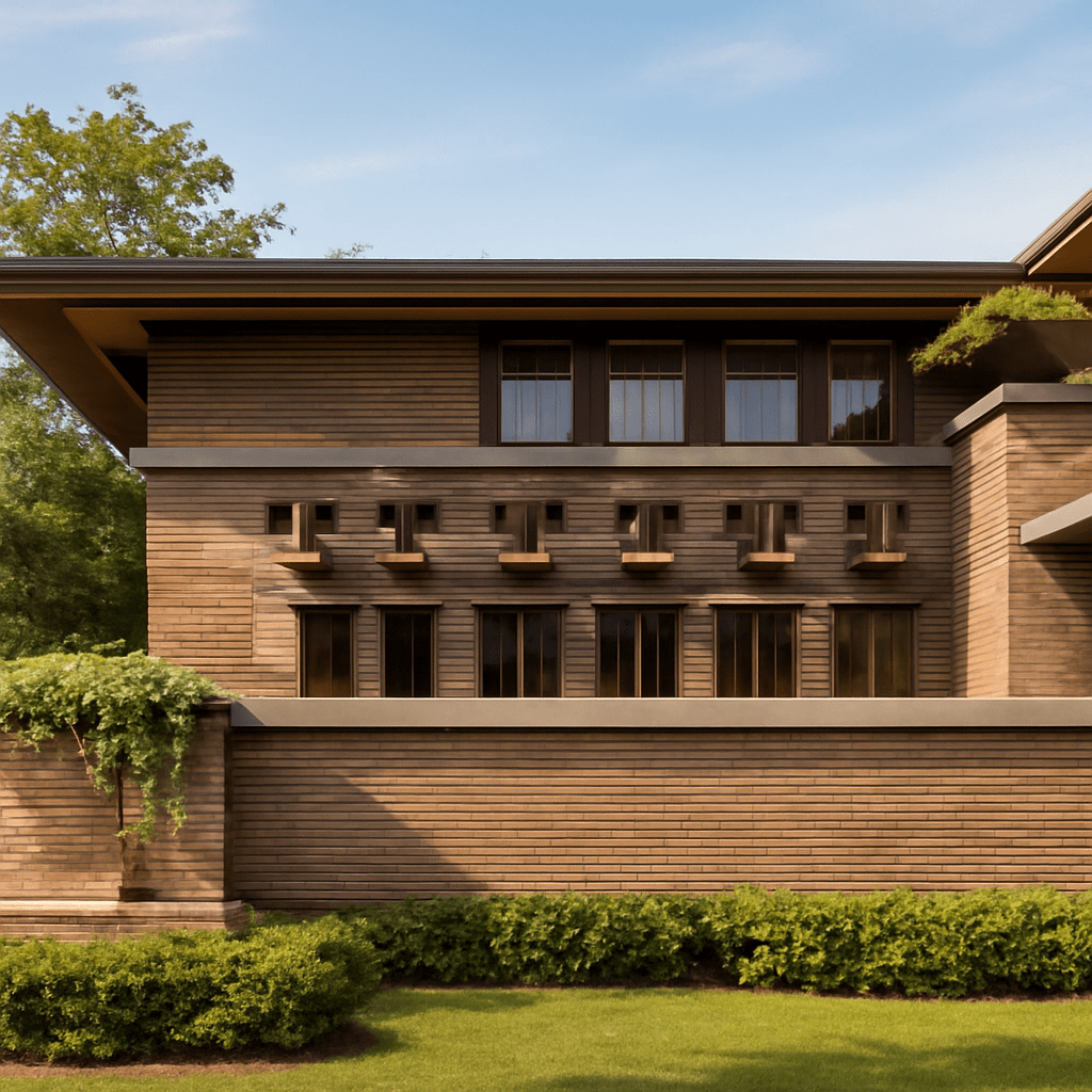
Prairie architecture is an early-20th-century American style defined by horizontal form, broad roof overhangs, open interiors, and a close relationship between house and site. Rather than treating rooms, furniture, windows, and ornament as separate elements, its designers composed them as one continuous environment.

Frank Lloyd Wright made the language internationally influential, but the style emerged from a wider Midwestern movement. Its strongest examples combine a low, landscape-oriented exterior with an interior sequence that unfolds around a central hearth.

Prairie Architecture in the Prairie School’s Midwestern Context

The Prairie School was a loosely connected group of architects working primarily in and around Chicago from the late 1890s through the 1910s. Its members included Wright, Marion Mahony Griffin, Walter Burley Griffin, George Washington Maher, and others who sought an American alternative to imported historical styles.

The flat or gently rolling Midwestern landscape helped shape their approach. Instead of emphasizing vertical towers, formal symmetry, or European classical details, Prairie architects developed buildings that seemed to grow out of the ground. The movement also drew from the Arts and Crafts ideal of honest materials and from Louis Sullivan’s belief that a building’s design should follow its purpose.

Prairie Style is therefore more specific than “a low house with a wide roof.” Its characteristic combination includes horizontal composition, carefully controlled geometry, integrated art glass, natural materials, and a planned experience from the site through the interior.

The Horizontal Exterior Language: Massing, Roofs, Eaves, and Window Bands

Start by reading a Prairie house from the ground up. Its massing is usually low and elongated, with strong horizontal lines in brick courses, trim, terraces, and retaining walls. Roofs are often shallow-pitched and hipped, making the building appear broader than it is tall. Deep, overhanging eaves extend those lines outward and create sheltered edges between house and landscape.

Windows reinforce the same direction. Groups of casements may form continuous bands beneath the eaves, while leaded or art-glass windows use geometric patterns rather than picturesque scenes. The windows admit light without breaking the building into unrelated openings. Their muntins, colors, and proportions often echo interior woodwork, rugs, light fixtures, or furniture.

Prairie exteriors commonly use brick, stucco, wood, and stone in restrained combinations. The materials are not merely applied surfaces: masonry can continue into garden walls, terraces, or interior piers. This continuity makes the house feel anchored to its site rather than placed on a neutral platform.

Open Plans, Central Hearths, and Spatial Flow

Inside, Prairie planning replaces a string of isolated formal rooms with a connected sequence. The living room, dining room, and entry may remain visually distinct, but partial-height walls, built-in bookcases, ceiling changes, and changes in floor level guide movement between them. The plan is open without being an undifferentiated loft.

A central fireplace or hearth usually acts as the organizing point. It provides physical warmth, but it also gives the plan a symbolic and visual center. Rooms may open toward it, turn around it, or frame it from a nearby passage. Wright frequently compressed entries and corridors before releasing occupants into larger living spaces, making arrival part of the architecture.

Integrated design extends to built-in seating, cabinets, light fixtures, decorative screens, rugs, and furniture. These elements establish a consistent scale and rhythm. The result is an interior that cannot be fully understood by looking at the exterior alone: the house’s horizontal lines continue through sightlines, ceiling planes, wood bands, and carefully positioned openings.

Frank Lloyd Wright Prairie Style: A Distinctive Contribution

Wright’s major contribution was to turn Prairie principles into a spatial system rather than a collection of visual traits. He arranged rooms along axes, layered views across the plan, and used compression and expansion to control how occupants experienced the house. A low roof might signal horizontality outside, while an elevated ceiling over the living room created a contrasting sense of release within.

His version of frank lloyd wright prairie style also depended on coordination. Art glass filtered daylight, masonry anchored the hearth, and furnishings extended the geometry of the architecture. Wright’s houses could be highly individualized, but they shared an ambition: architecture should shape daily life as a unified work of art.

Frank Lloyd Wright Prairie Houses: Robie, Martin, Willits, and Coonley

These Frank Lloyd Wright prairie houses show how the language changed from one commission to another:

  • Frederick C. Robie House, Chicago, 1908–1910: Notice the dramatic cantilevered roof planes, long brick walls, narrow window bands, and sheltered terraces. The house stretches across its urban lot, while its open living and dining areas are organized around a central fireplace and connected by flowing sightlines.
  • Ward W. Willits House, Highland Park, 1902: This early mature Prairie house uses a cruciform plan, with four wings extending from a central core. Its low roof, projecting axes, art-glass windows, and hearth-centered arrangement reveal Wright testing the style’s basic vocabulary in a more compact composition.
  • Darwin D. Martin House, Buffalo, 1903–1905: The Martin House complex demonstrates how Prairie design could expand into a carefully coordinated estate. Interconnected rooms, broad rooflines, patterned art glass, landscape planning, and extensive built-in furnishings create a continuous environment rather than a single isolated building.
  • Avery and Queene Coonley House, Riverside, 1908–1912: The Coonley House combines low horizontal masses with a more playful decorative program. Its abstract art glass, varied building volumes, terraces, and axial relationships show that Prairie architecture could be richly expressive while retaining its close connection to landscape and domestic movement.
Baroque Church Architecture: Its Defining Characteristics

Baroque Church Architecture: Its Defining Characteristics

Baroque church architecture uses curved plans, layered facades, domes, controlled light, illusionistic ceilings, sculpture, and rich materials to turn worship into a dramatic experience across Europe.

Different Mediums of Art: A Practical Guide to Materials and Forms

Different Mediums of Art: A Practical Guide to Materials and Forms

Different mediums of art: define medium, material, technique, format, and genre, and compare drawing, painting, printmaking, photography, digital art, sculpture, performance, sound, and mixed media.

Nature Colors: How to Build Balanced Palettes from Natural Scenes

Nature Colors: How to Build Balanced Palettes from Natural Scenes

Build nature colors by recording relationships, not by copying every visible color. Start with the scene’s largest color mass, add supporting colors from nearby areas, reserve the strongest contrast for an accent, and use a neutral to control the result. This produces a usable nature palette for interiors, branding, illustration, or digital design.

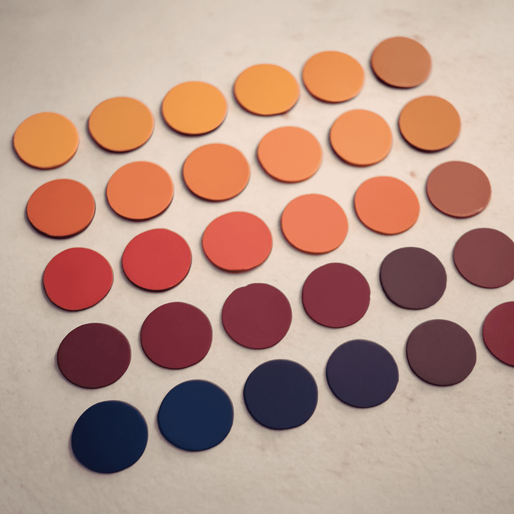
Sunsets make the method easy to see because they often combine intense warm light with cool atmospheric shadows. The goal is not to preserve every orange, pink, blue, and purple in the image. It is to decide which colors should occupy the most space, which should create structure, and which should attract attention.

Nature Colors: Read a Scene Before You Sample

Observe the scene at a distance before choosing swatches. Squint, blur the image, or reduce it to a small thumbnail. Details disappear and the dominant value masses become clear: perhaps a dark foreground, a luminous middle sky, and a narrow band of bright light near the horizon.

  1. Find the largest area. This is usually the sky, water, foliage, rock, or ground. Its color and value should guide the palette.
  2. Locate the visual support. Notice the colors that sit beside the dominant area and make it feel warmer, cooler, lighter, or darker.
  3. Identify the focal accent. Look for a small area with unusual brightness, saturation, or temperature, such as a sunlit cloud or red reflection.
  4. Notice what calms the scene. Haze, stone, sand, gray-blue shadow, and softened earth tones often serve as natural neutrals.

Sample from representative areas rather than isolated highlights. A tiny sun reflection may be almost white, but treating it as a major palette color will make the finished scheme harsh. Five considered colors are generally more useful than fifteen unweighted samples.

Build a Nature Palette with Four Color Roles

Assign each chosen color a job. These roles describe how colors behave in the scene and how much visual space they should occupy in a design. The percentages below refer to visual area, not the number of objects or swatches.

  • Dominant color: 45–60%. Choose the broadest field, such as muted blue sky, olive foliage, or a warm sand-colored shore. It establishes the palette’s atmosphere and should usually be moderate in saturation.
  • Supporting colors: 20–35% combined. Select one or two neighboring colors that explain variation in the scene. A lavender cloud bank may support a peach sky; a mossy green may support a deeper forest tone.
  • Accent color: 5–10%. Use the scene’s strongest point of contrast sparingly. Sunset accents might include coral, amber, or a concentrated red-orange glow. The accent should guide the eye rather than cover the design.
  • Neutral color: 10–25%. Choose a low-chroma color already present in the landscape, such as warm gray, fog, cream, charcoal, taupe, or blue-gray. It creates breathing room between more expressive hues.

These roles can overlap in hue but differ in value or saturation. For example, a sunset palette might use pale peach as the dominant, dusty rose as support, vivid tangerine as the accent, and deep blue-gray as the neutral. The neutral does not need to be gray; it only needs to be quiet enough to balance the brighter colors.

Balance Value, Temperature, and Saturation

Hue tells you whether a color is orange, blue, green, or violet, but hue alone does not create coherence. Compare every sample by value, temperature, and saturation before finalizing the palette.

  • Value: Include a clear light-to-dark range. If every color is light, the palette loses structure; if every color is dark, the scene feels heavy. A pale sky, middle-value support, and dark anchor create readable contrast.
  • Temperature: Balance warm colors with cool ones. Orange and rose can feel excessive when surrounded only by warm beige. A blue-gray, violet, or cool charcoal can make the warmth appear brighter without increasing saturation.
  • Saturation: Keep the most intense color limited. Reduce saturation in the dominant and supporting colors until the accent has room to work. This prevents a sunset palette from becoming uniformly bright.

A practical check is to view the palette in grayscale. If all the swatches merge, adjust their values before changing their hues. Then view them together at full color and mute any supporting color that competes with the accent. Preserve one or two colors close to neutral so the eye has somewhere to rest.

Four Sunset Palette Structures: Calm Wash, Dark Anchor, Warm Glow, and Dusk Fade

Use these structures as starting points rather than fixed swatches. Each one describes a different relationship among light, shadow, warmth, and neutral space.

  • Calm Wash: Allocate about 35% pale peach or soft apricot, 25% misty lavender, 20% blue-gray, 10% sandy neutral, and 10% muted coral. Keep all but the coral relatively soft in saturation. This scheme suits quiet interfaces, bedrooms, stationery, and airy editorial layouts.
  • Dark Anchor: Use 40% deep indigo or charcoal, 20% dusky violet, 15% burnt orange, 10% coral, and 15% warm gray. The dark dominant gives the sunset dramatic weight, while the warm accent stays small and luminous. Apply it to cinematic graphics, event branding, or a room with a strong focal wall.
  • Warm Glow: Build around 30% amber, 25% peach, 15% rose, 15% warm cream, and 15% muted brown. Let amber and peach carry most of the area, but lower their saturation slightly so the rose accent remains distinct. This is effective for welcoming hospitality, food, lifestyle, and celebratory designs.
  • Dusk Fade: Combine 30% blue-gray, 20% mauve, 20% plum, 15% charcoal, and 15% faded apricot. Keep the apricot as the only clear warm note or use it in a small highlight. The cool majority creates a restrained evening mood for packaging, fashion, and reflective digital compositions.

Test the selected structure in a simple composition or space before committing. Create three small layouts: one with the dominant color as the background, one with the neutral as the background, and one with the dark anchor behind the accent. Check text readability, focal order, and whether the accent still feels special. If the design looks loud, reduce saturation or increase neutral area; if it looks flat, strengthen the value difference between the dominant and supporting colors.

What’s My Decorating Style Quiz? Build a Practical Interior Direction

What’s My Decorating Style Quiz? Build a Practical Interior Direction

What’s my decorating style quiz? Score your choices for form, material, color, pattern, age, and visual density, then turn your strongest signals into a flexible palette, furniture, and object plan.