Understanding Color Harmony in Interior Design
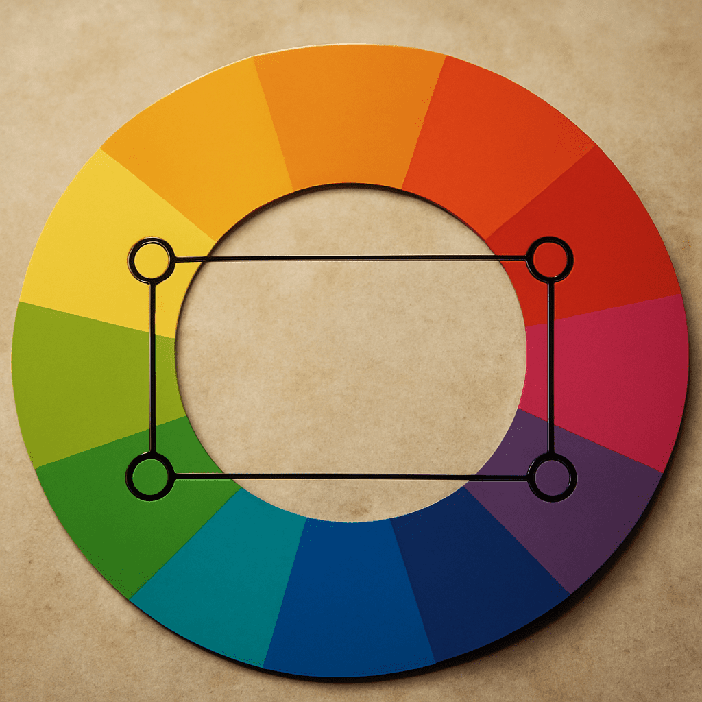
Creating visually pleasing spaces often hinges on understanding color harmony. By mastering the art of choosing colors that complement each other, you can transform interiors into cohesive and inviting environments. This article delves into the principles of color harmony, focusing on tetradic colors and how to use a color wheel effectively for selecting colors that go well together in your interior design projects.
What is Color Harmony?
Color harmony refers to the aesthetically pleasing arrangement of colors that creates balance and a sense of order. When colors are harmonious, they work together to create a unified look that is both appealing and functional. The concept of color harmony is essential in design, art, and any visual medium where the role of color is critical. Harmonious colors often evoke certain emotions, can highlight particular features, and influence the overall ambiance of a space.
Exploring Tetradic Colors
Tetradic colors form a rich and vibrant palette, consisting of four colors arranged in two complementary pairs on the color wheel. This scheme offers a wide array of possibilities and can create dynamic and bold looks when applied correctly. To identify tetradic colors, select any two pairs of complementary colors, forming a rectangle on the color wheel. The key to successfully using tetradic colors is balancing warm and cool tones to maintain harmony and avoid visual chaos.
For example, a tetradic scheme might include red and green as one pair, complemented by blue and orange as the other pair. The challenge lies in ensuring that one color dominates while others play supporting roles to maintain harmony and coherence.
Selecting Colors That Go Well Together
Choosing colors that go well together involves understanding their relationships on the color wheel and considering the mood and function of the space. Here are some tips to help you select complementary colors:
- Understand color relationships: Use the color wheel to explore primary, secondary, and tertiary colors. Colors that sit next to each other are analogous and tend to create harmonious designs.
- Consider the context: Reflect on the purpose of the space and the emotions you want to evoke. For instance, calming colors like blues and greens are ideal for bedrooms, while vibrant colors like reds and yellows might suit a lively kitchen or dining area.
- Experiment with shades and tones: Create depth and interest by varying the shades and tones within your palette. Mixing lighter and darker versions of a color can enhance its versatility and appeal.
How to Use a Color Wheel Effectively
The color wheel is an invaluable tool for anyone looking to understand and apply color harmony in design. Here are steps to effectively use a color wheel:
- Familiarize yourself with the color wheel: Understand the arrangement of primary, secondary, and tertiary colors. Recognize complementary, analogous, and triadic color schemes.
- Identify your base color: Choose a primary color that will be the foundation of your design. This color often dictates the mood and style of the space.
- Select complementary colors: Use the color wheel to find hues opposite your base color for a dynamic contrast. Balanced complementary colors can add vibrancy without overwhelming.
- Test tetradic arrangements: Explore tetradic color schemes by selecting two pairs of complementary colors. Remember to consider the proportions and dominance of each color to maintain harmony.
- Incorporate neutrals: Integrate neutral shades to break up the color scheme and provide visual relief. Neutrals like white, black, and gray can help balance vibrant palettes and enhance focus on key elements.
With these guidelines, you can confidently use a color wheel to create color schemes that enhance the beauty and functionality of your interiors, ensuring spaces that are not only visually stunning but also harmonious.