Colors That Look Good Together: A Guide for Designers
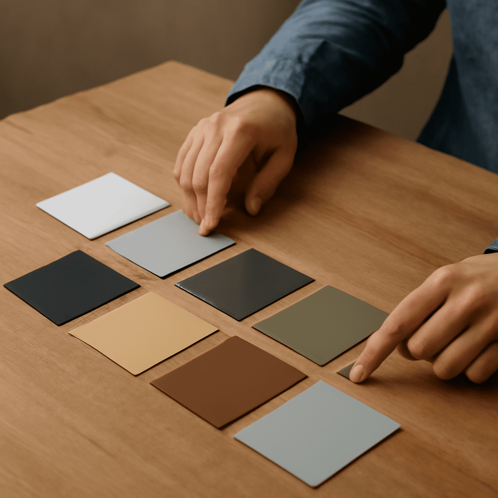
Creating visually appealing designs requires a solid understanding of how colors interact. Knowing colors that look good together is crucial for designers aiming to evoke specific emotions and aesthetics. This guide will delve into the principles and popular combinations that can enhance your design projects.
Understanding Color Harmony
Color harmony refers to the pleasing arrangement of colors. It’s essential in design because harmonious colors can create balance and draw attention. The basic concept revolves around the color wheel, where relationships between colors are defined by their position. Complementary, analogous, and triadic are some of the common schemes used to achieve harmony. These combinations help in establishing a mood or tone for the design and ensure that the colors work together rather than clash.
Principles of Color Pairing
Effective color pairing relies on understanding the following principles:
- Contrast: High contrast combinations, such as black and white, create a striking effect, while low contrast combinations, like pastel shades, offer a softer look.
- Temperature: Warm colors (reds, oranges, yellows) contrast with cool colors (blues, greens, purples) to create visual interest.
- Balance: Ensure an equal weight of colors to maintain visual stability. Overuse of a single color can overwhelm.
- Context: Consider the cultural and psychological associations of colors. For example, red can symbolize passion or danger depending on context.
Popular Color Combinations
Designers often rely on tried-and-true combinations. Here are some good colors that go together:
- Blue and Orange: This complementary pair is energetic and vibrant, suitable for modern designs.
- Green and Pink: Offering a fresh and playful look, this combination is popular in fashion and lifestyle brands.
- Black and Gold: Timeless and elegant, this pair is perfect for luxury and high-end products.
- Purple and Yellow: A striking contrast that exudes creativity and boldness.
- Gray and White: Clean and sophisticated, often used in minimalistic designs.
Tips for Creating Your Own Color Schemes
While popular combinations are a great starting point, creating a unique color scheme can set your design apart. Here are some tips:
- Start with a Base Color: Choose a dominant color and build around it using complementary or analogous colors.
- Use Color Tools: Utilize online tools like Adobe Color or Coolors.co to experiment with different palettes.
- Consider the Emotion: Think about the emotion or message you want to convey and choose colors that align with those feelings.
- Test and Adjust: Always test your color combinations in different contexts to see how they perform under varying conditions.
Mastering the art of color pairing not only enhances the visual appeal of your designs but also ensures that your message is communicated effectively. By understanding and applying the principles outlined in this guide, you can confidently select colors that look good together and elevate your creative projects.